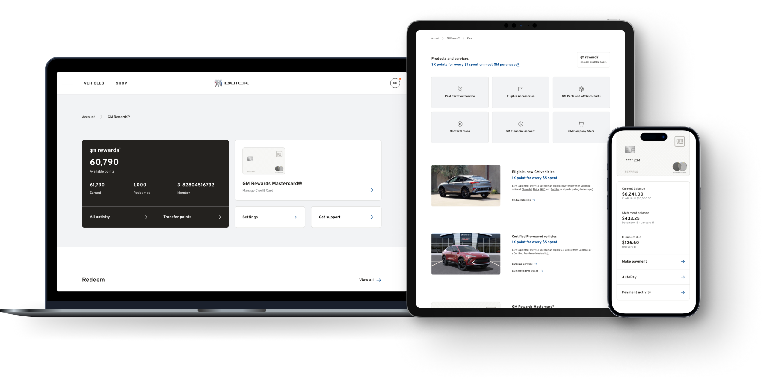
Led the redesign of the GM rewards authenticated experience for a new program launch by unifying earning, redemption, and credit card management across all five brands.
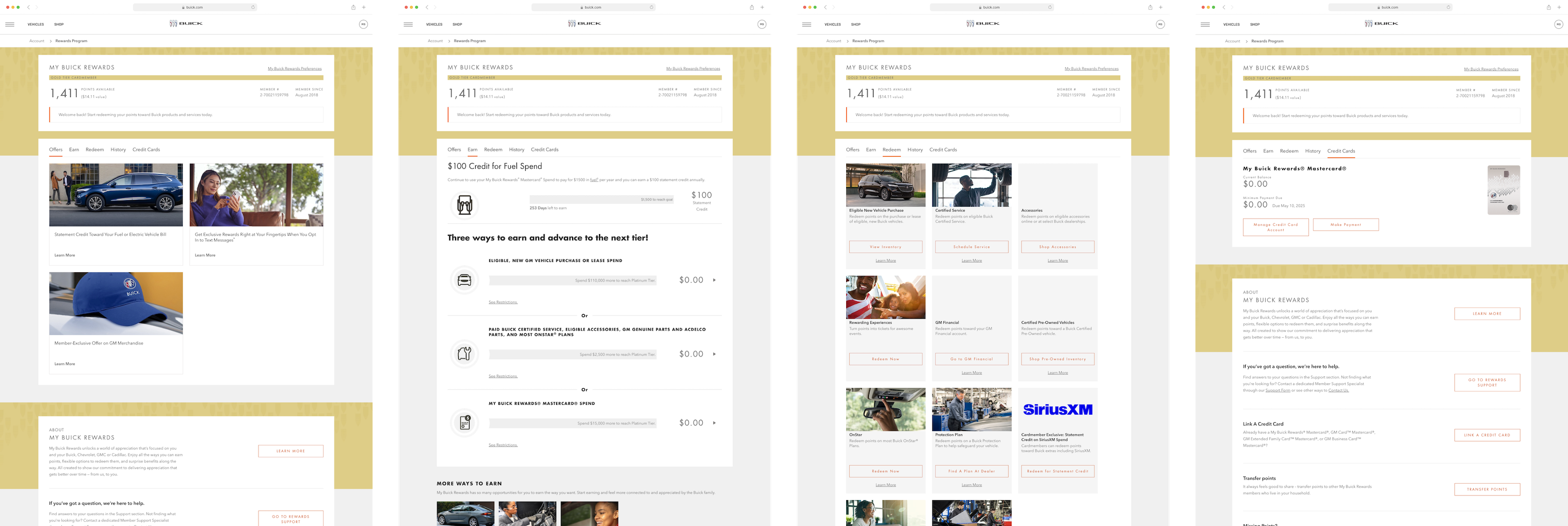
Key information like point balance, earning, and redemption was hard to find. Inconsistent layouts forced users to relearn the experience across pages.
Users didn't understand redemption options or how to use their points. Key actions weren't surfaced, causing friction and drop-off.
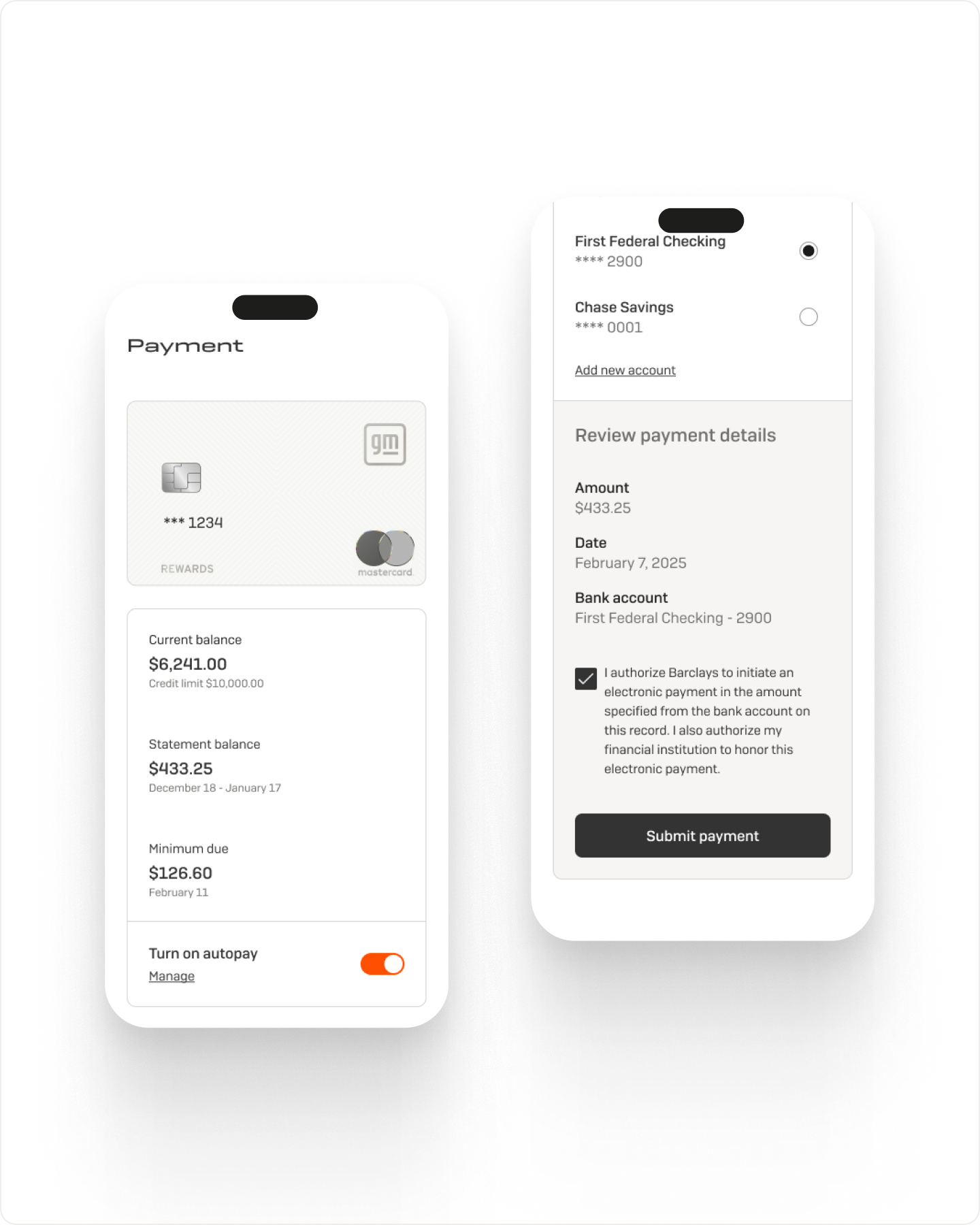
The Barclays partnership introduced spend tracking, rewards multipliers, and required disclosures. Platform constraints limited how reward information could be presented.
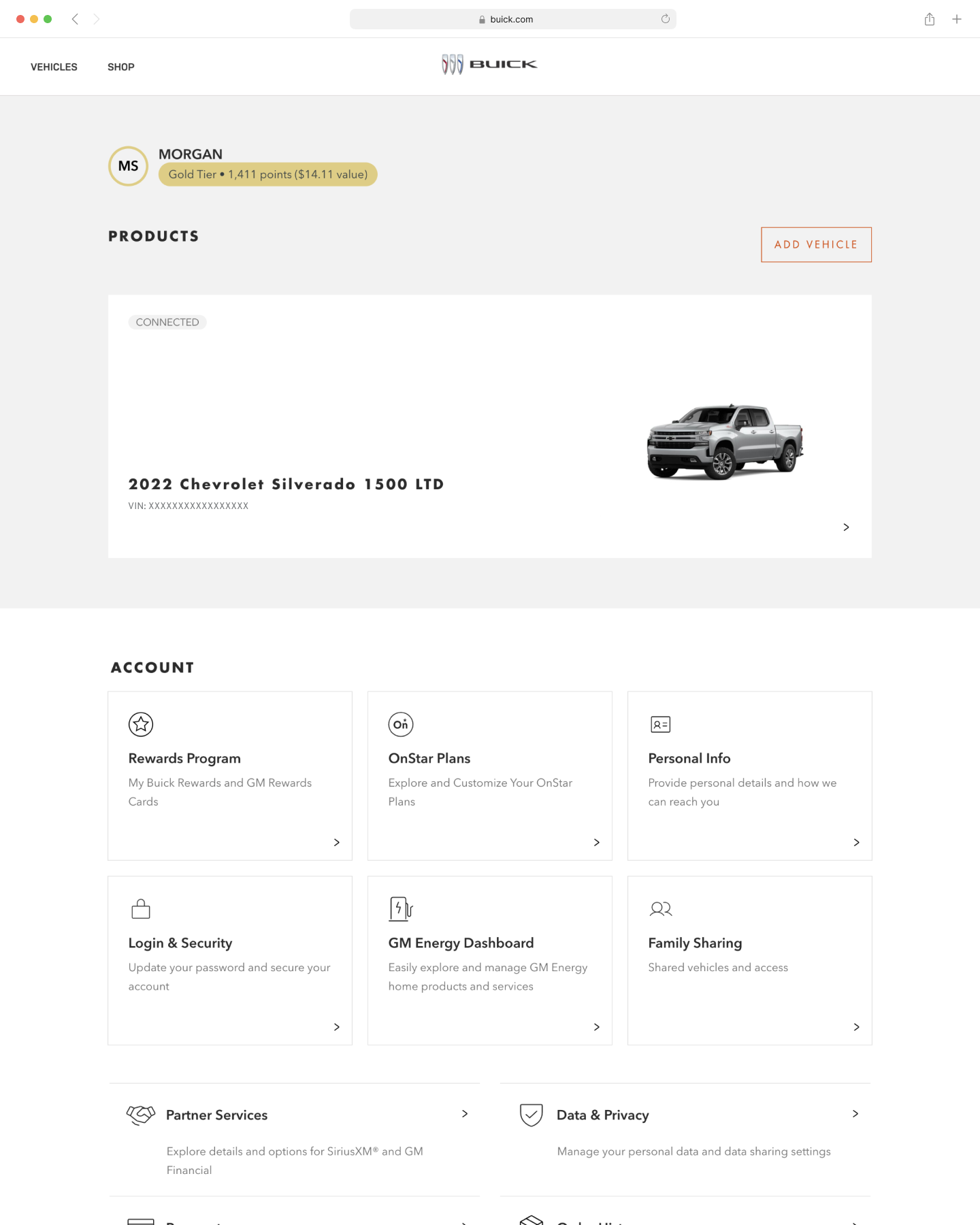
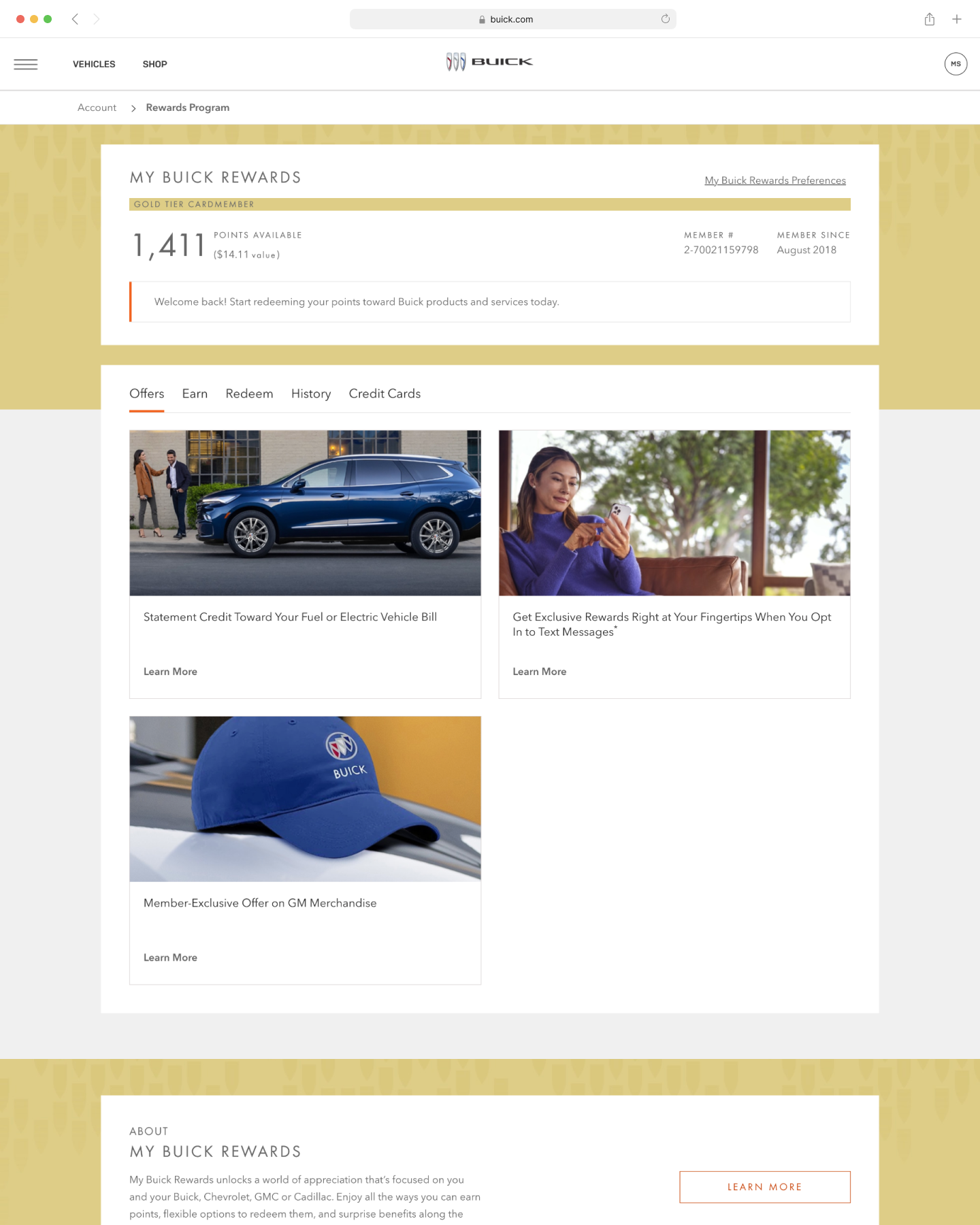
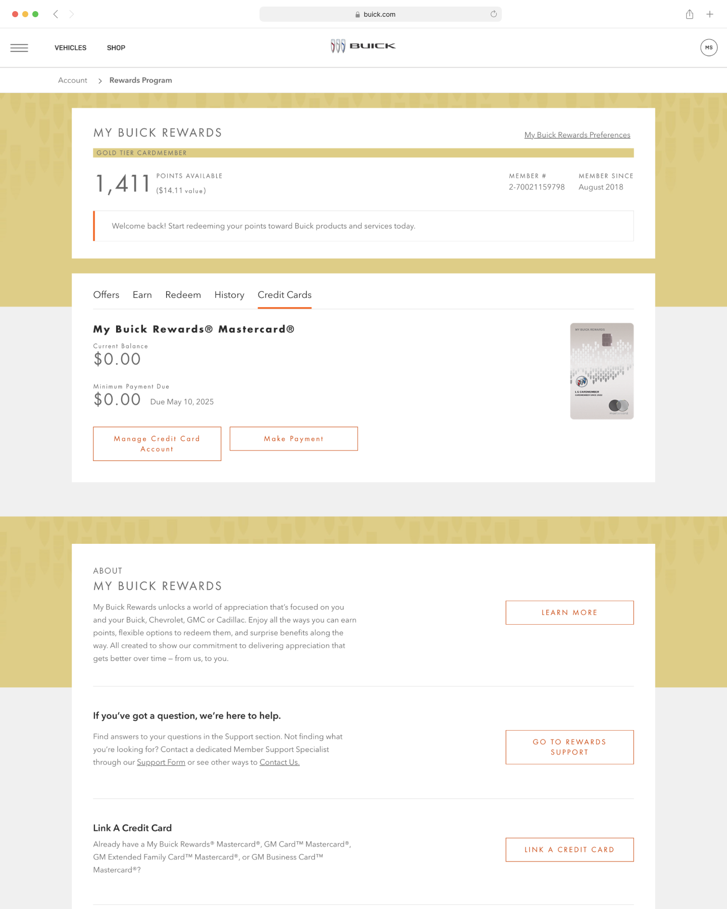
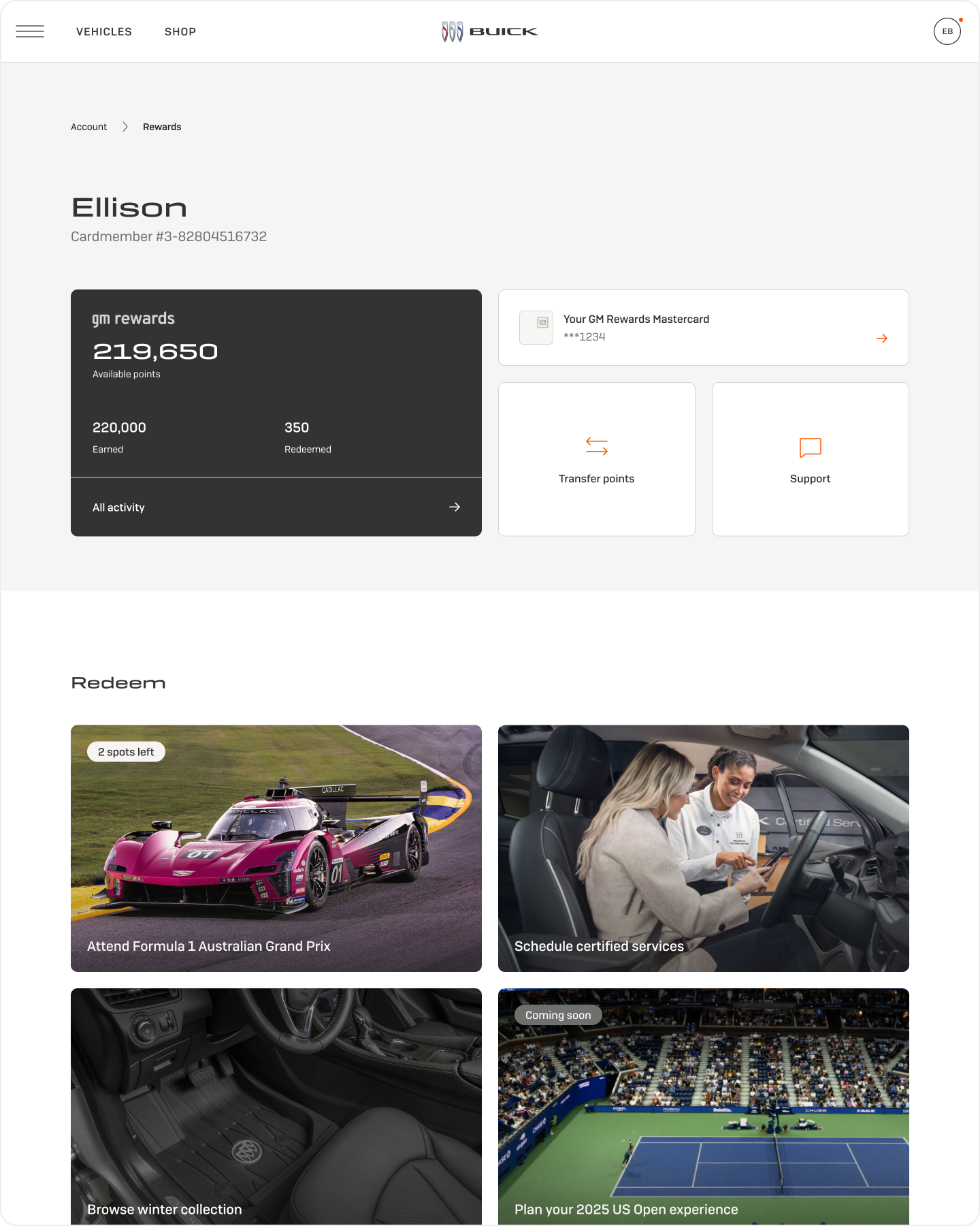
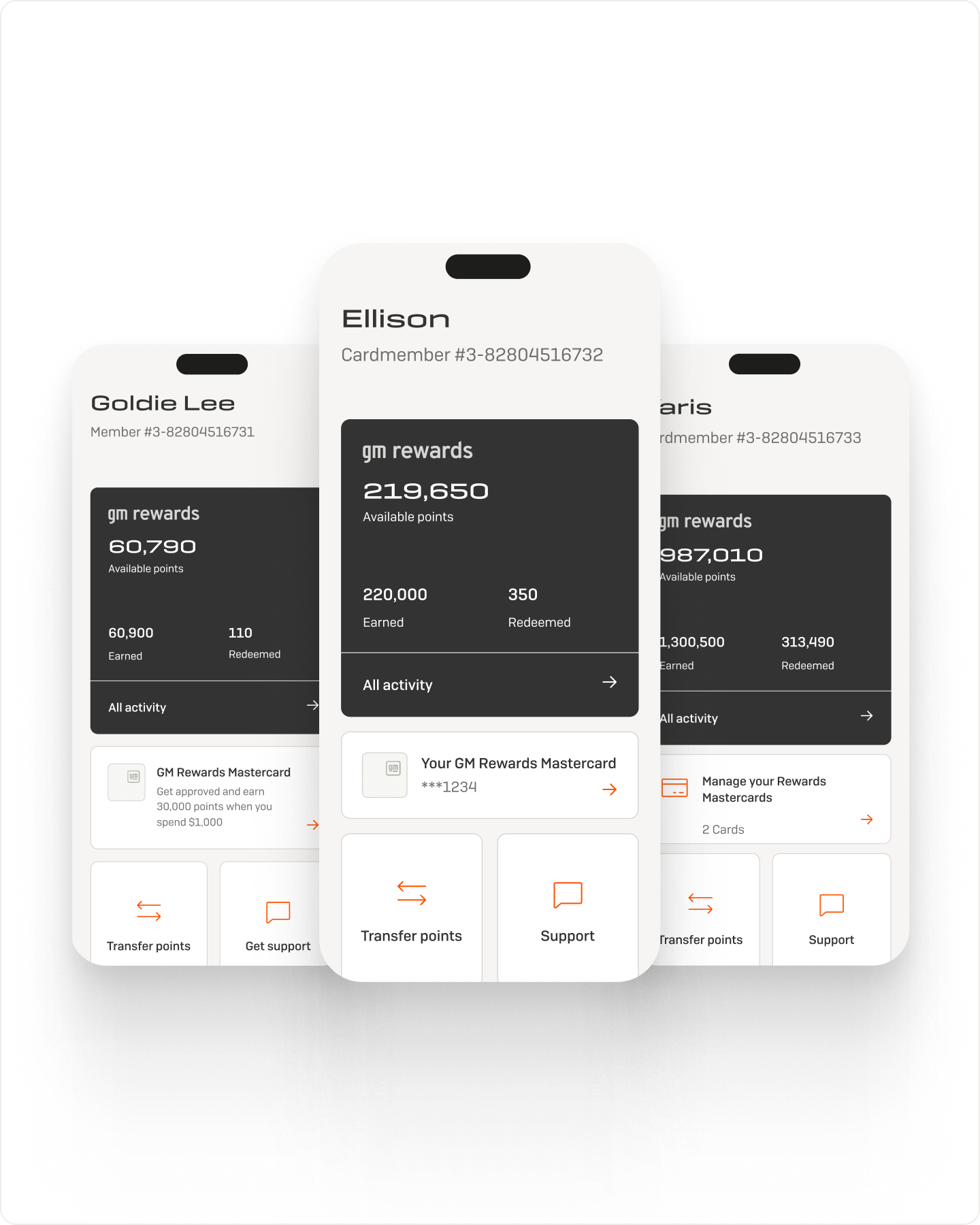

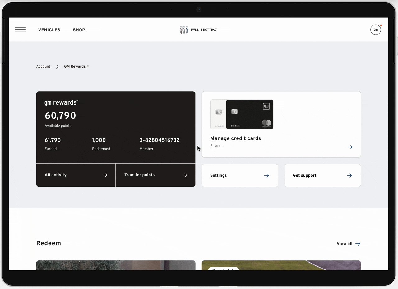
Replaced scattered tab navigation with a single hub surfacing points, activity, and primary actions, increasing engagement with top-level actions and reducing navigation friction.
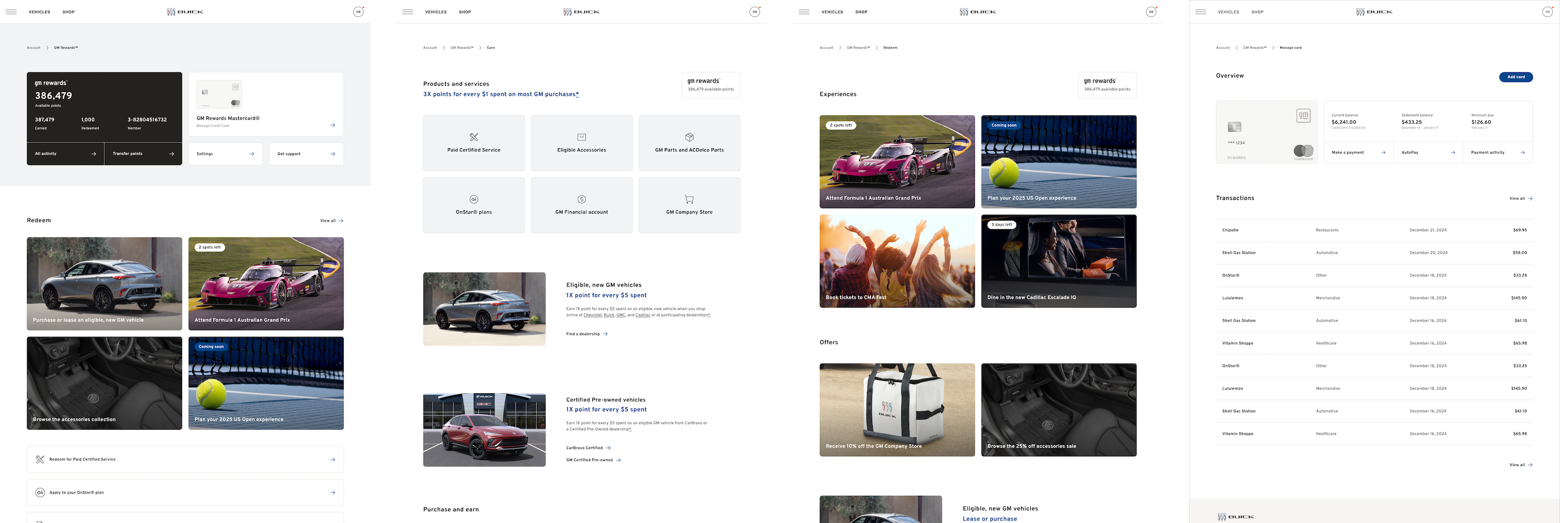
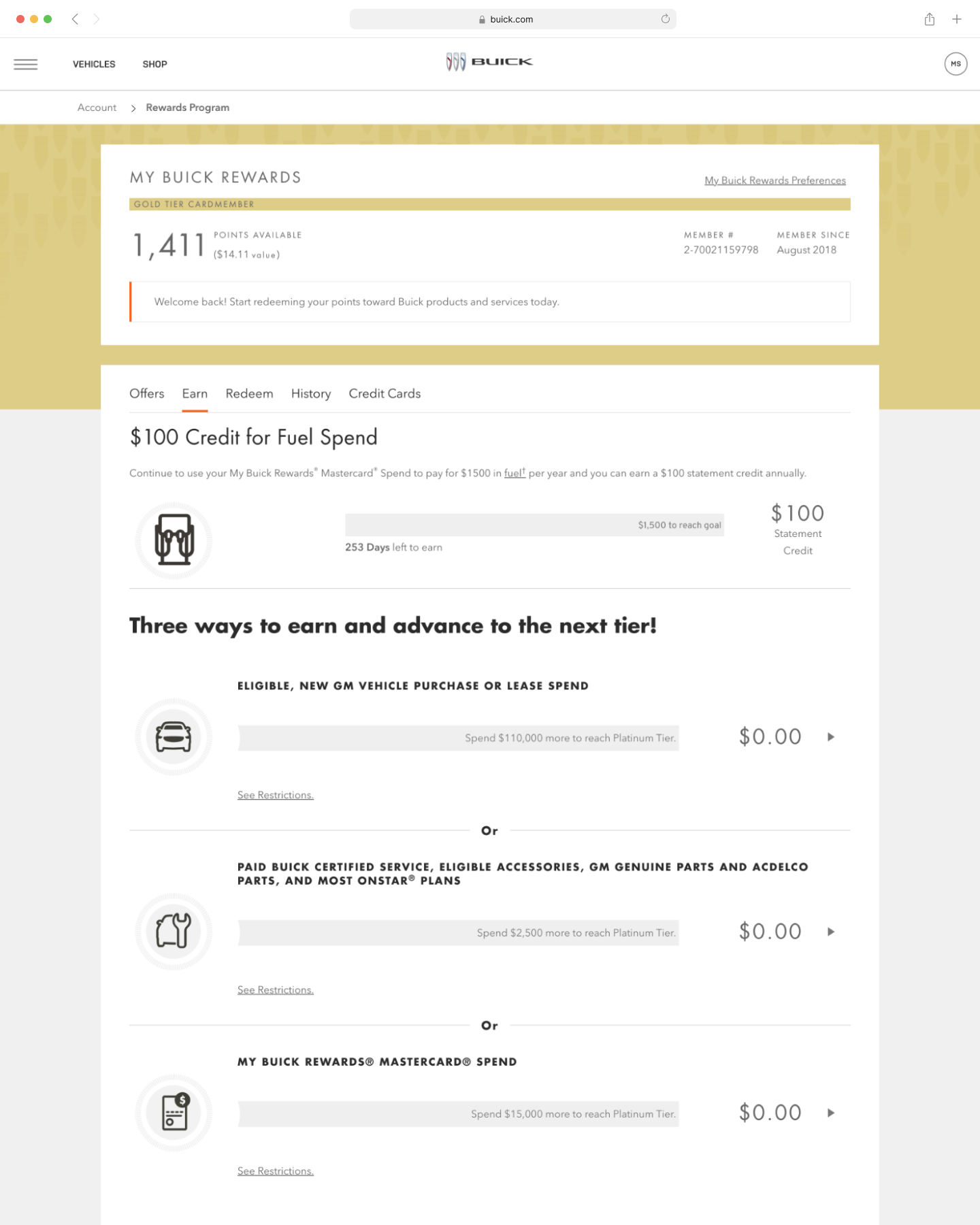
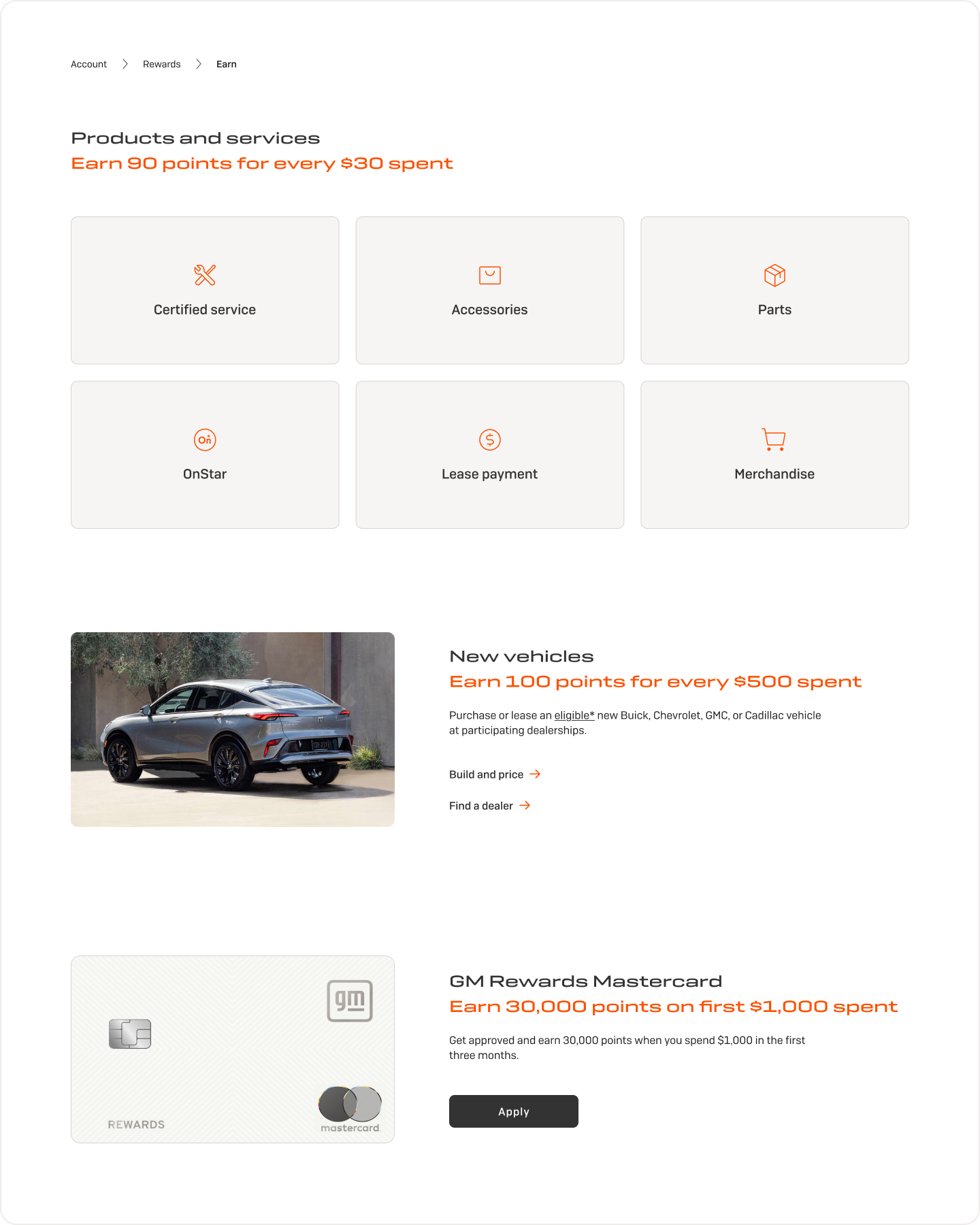
Made earning transparent with clear multipliers and earning categories. Users no longer had to decode hidden rules or search across pages to understand point value.
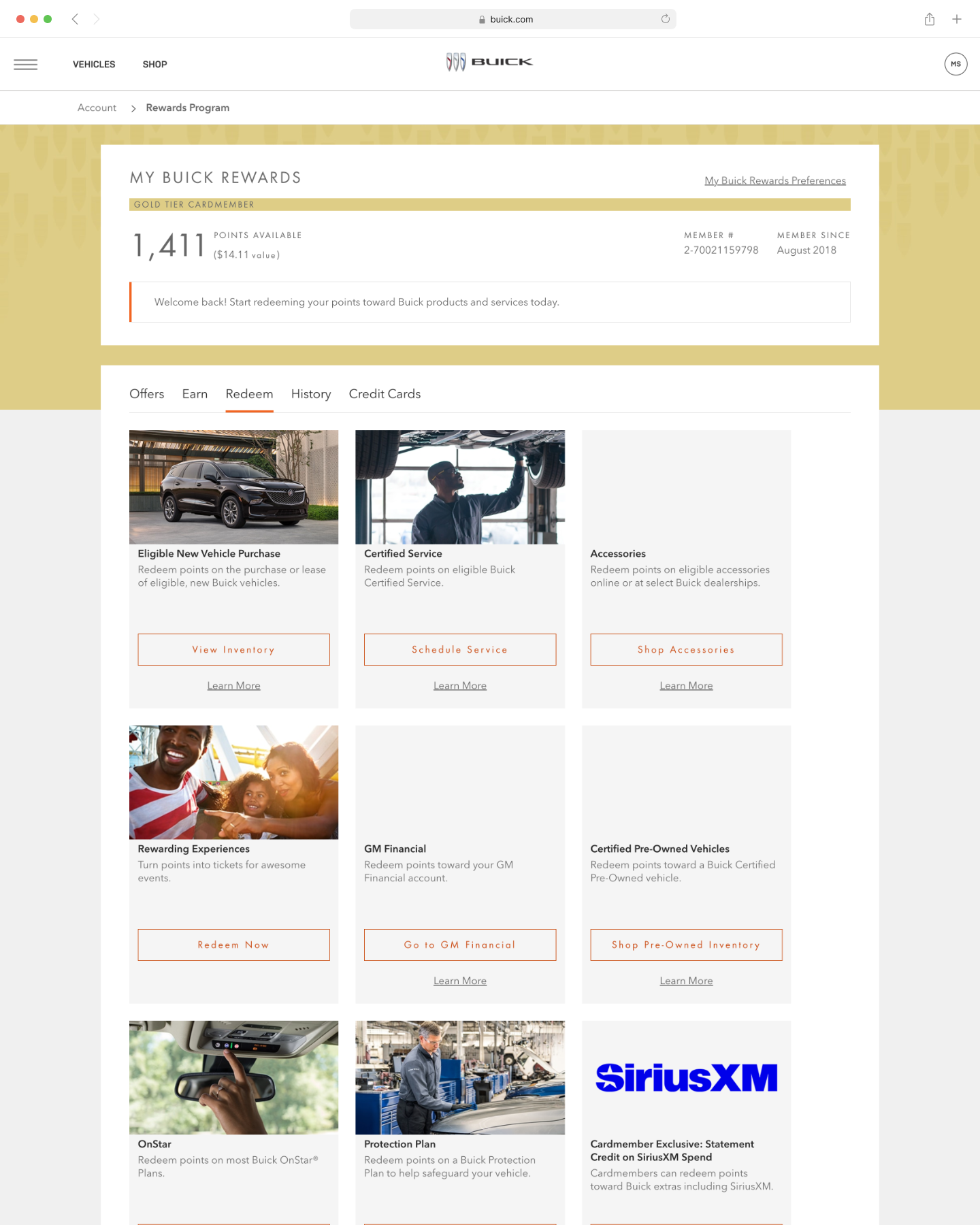
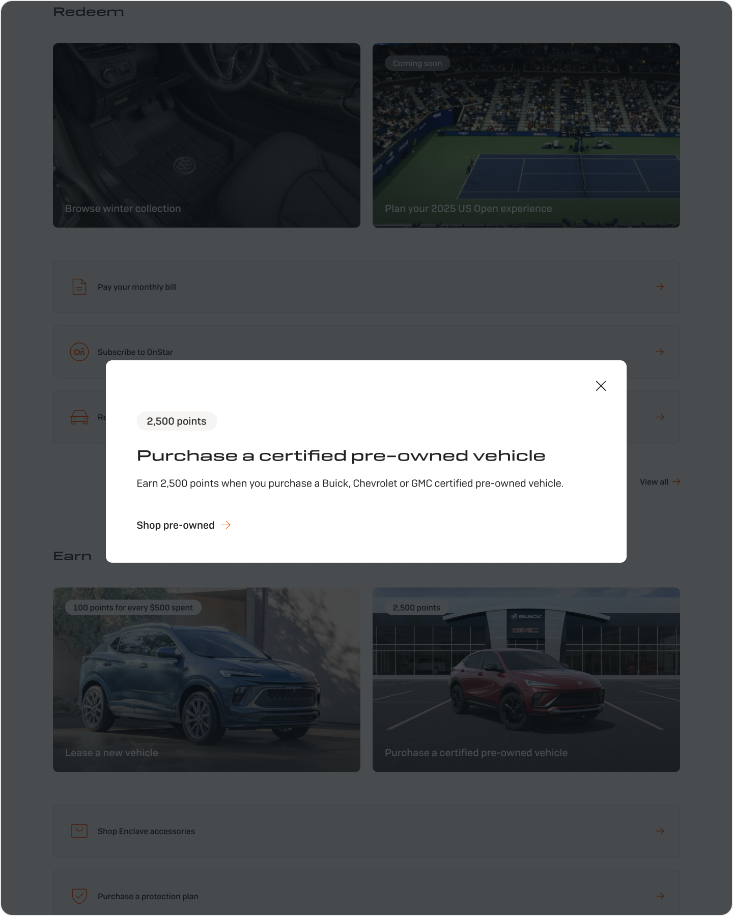
Surfaced redemption options previously buried three clicks deep and clarified point values across categories, increasing total redemption rate by 8%.
Built credit card functionality (payments, transaction history, and autopay) within the rewards platform, navigating Barclays API constraints and compliance requirements.
After launching across all five GM brands, the redesigned experience showed strong early traction.
Next project
OnStar
Activation