Logo: LH

Sustainit

WHEN
Sept - Nov 2022
TEAM
Blair Fields, Meera Amin, Mia Schaftel, Rachel Thomas
ROLE
UX Researcher and Designer
TOOLS
Figma, Miro, Adobe Photoshop
SustainIt is a conceptual app to combat the effects of fast fashion by empowering consumers with tools and knowledge to donate, resell, and shop sustainably.
Skip to Solution
See More Line
Background
Addressing the harmful effects of fast fashion.
Today, the appeal of inexpensive, trendy clothing often overshadows the underlying issues of unfair labor practices, harmful materials, overproduction, and environmental degradation.

SustainIt targets environmentally conscious consumers who face time constraints in sustainable shopping practices. By offering trendy, eco-friendly alternatives, SustainIt aims to transform shopping habits and create a culture of sustainable fashion choices.
Research
Competitive analysis: analyzing existing solutions
We conducted a competitive analysis of existing digital platforms addressing the negative effects of fast fashion. This process identified current solutions and revealed design opportunities for innovative, digital features that could lead to actionable change in consumer behavior.
User Interviews: uncovering consumer motivations and pains
Through interviews with 12 fashion consumers, we gained insights into shopping behaviors, experiences with second-hand reselling, and motivations behind brand choices. This research aimed to identify obstacles preventing consumers from adopting sustainable fashion practices. 
Key research insights:

01

Trend-driven consumption
The rapid evolution of fashion trends motivates consumers to continuously purchase new clothes as they strive to stay current.

03

Convenience drives behavior
While many consumers express interest in reselling and donating, time constraints and lack of resources often lead them to default to easily accessible fast fashion options.

02

Balancing cost and quality
Consumers express a willingness to invest in timeless, high-quality pieces, while accepting lower quality for trendy, inexpensive items.

04

Demand for a single platform
A significant market gap exists for a comprehensive platform that educates consumers about fast fashion's impact and facilitates sustainable shopping, donations, and reselling.
Defining the Problem
To mitigate the negative impacts of fast fashion, how might we empower consumers with the knowledge and tools to make sustainable fashion choices?
Target Audience

Primary

Trend-Driven Sustainability Consumers

The primary target audience is fast fashion consumers, between ages 16-35, who favor convenience and affordability, but are interested in exploring more sustainable fashion practices.

Secondary

Sustainability-Minded Consumers

The secondary target audience are time-affluent consumers, between ages 35-55, who prioritize quality and materials, and are curious in exploring and adopting more sustainable fashion practices.
Ideation
Personas: converting insights from themes into personas
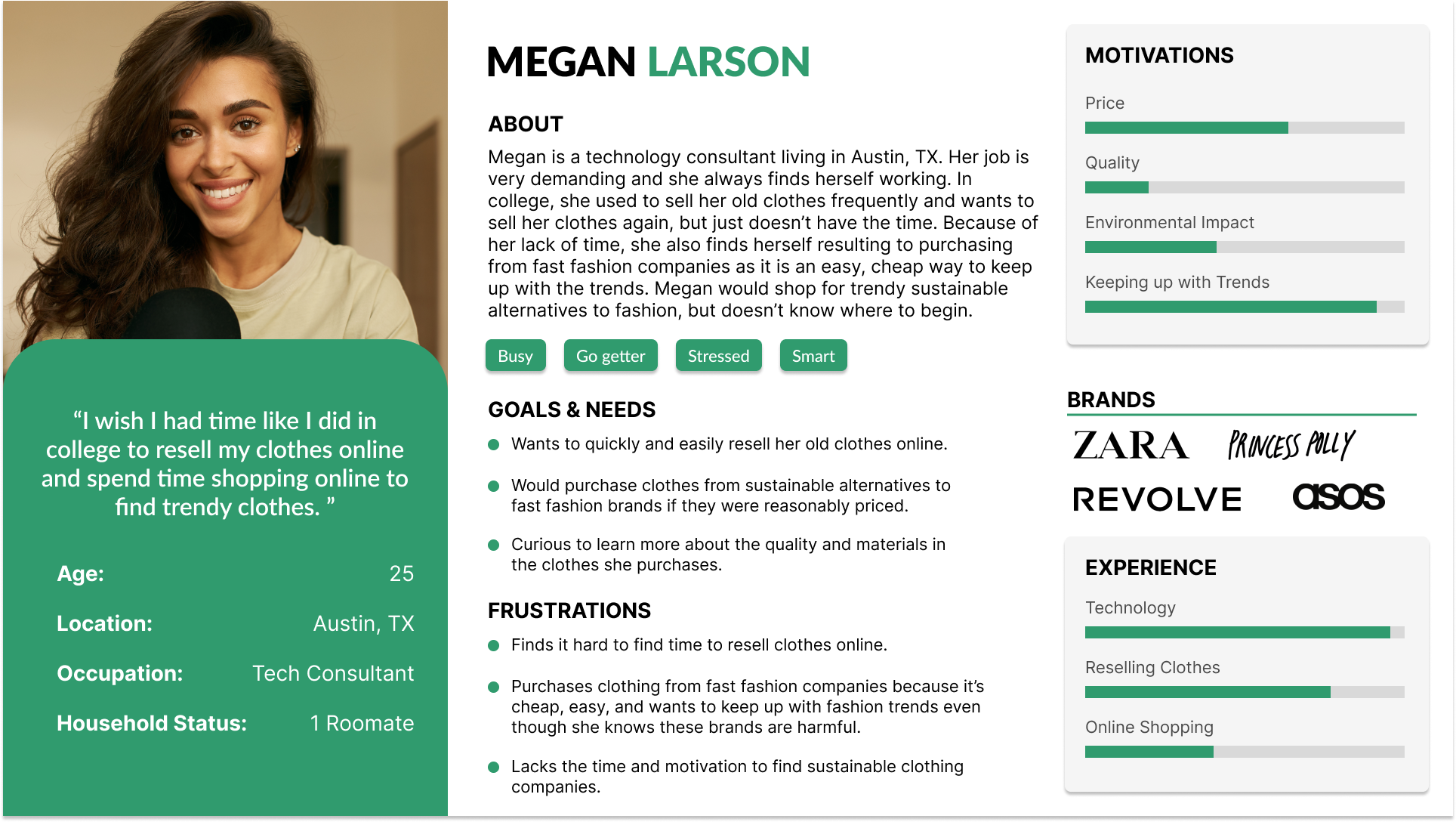
We formed our research insights into four key themes, resulting in the creation of four distinct personas. These personas summarize the motivations, frustrations, goals, and technological ability of our target users related to fashion consumption.
Click to enlarge
Sketching: exploring solutions through storyboards
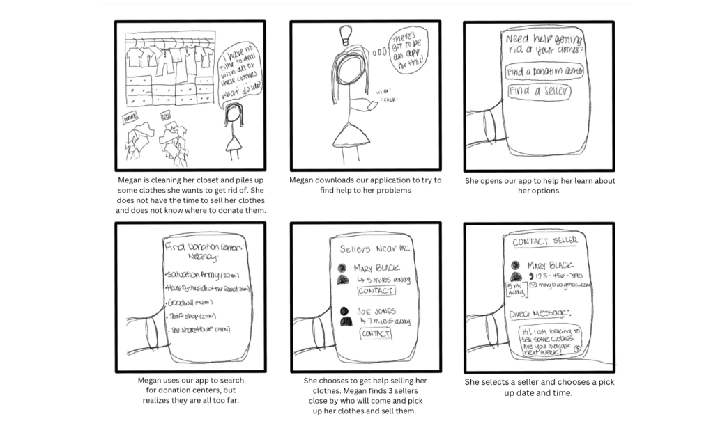
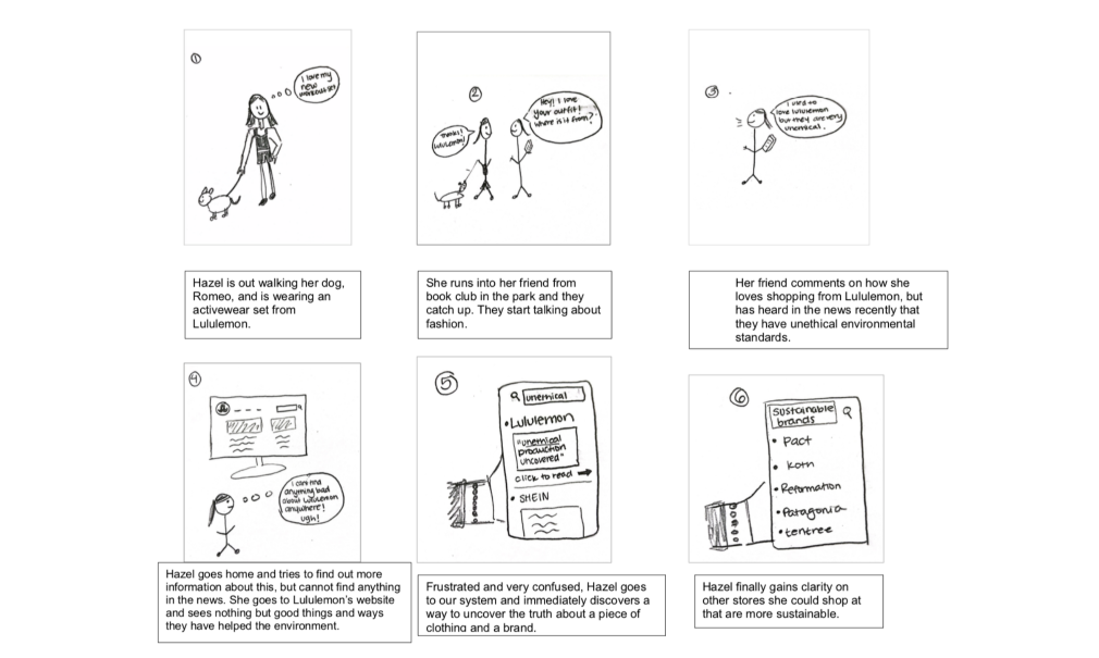
After a series of sketching exercises to explore a variety of ideas, we developed storyboards for two primary personas, each representing a target audience group. These focused on addressing two critical pain points: streamlining the donation and reselling process and easing the discovery of sustainable alternatives to fast fashion brands.
Click to enlarge
User Flows
Mapping the user journey.
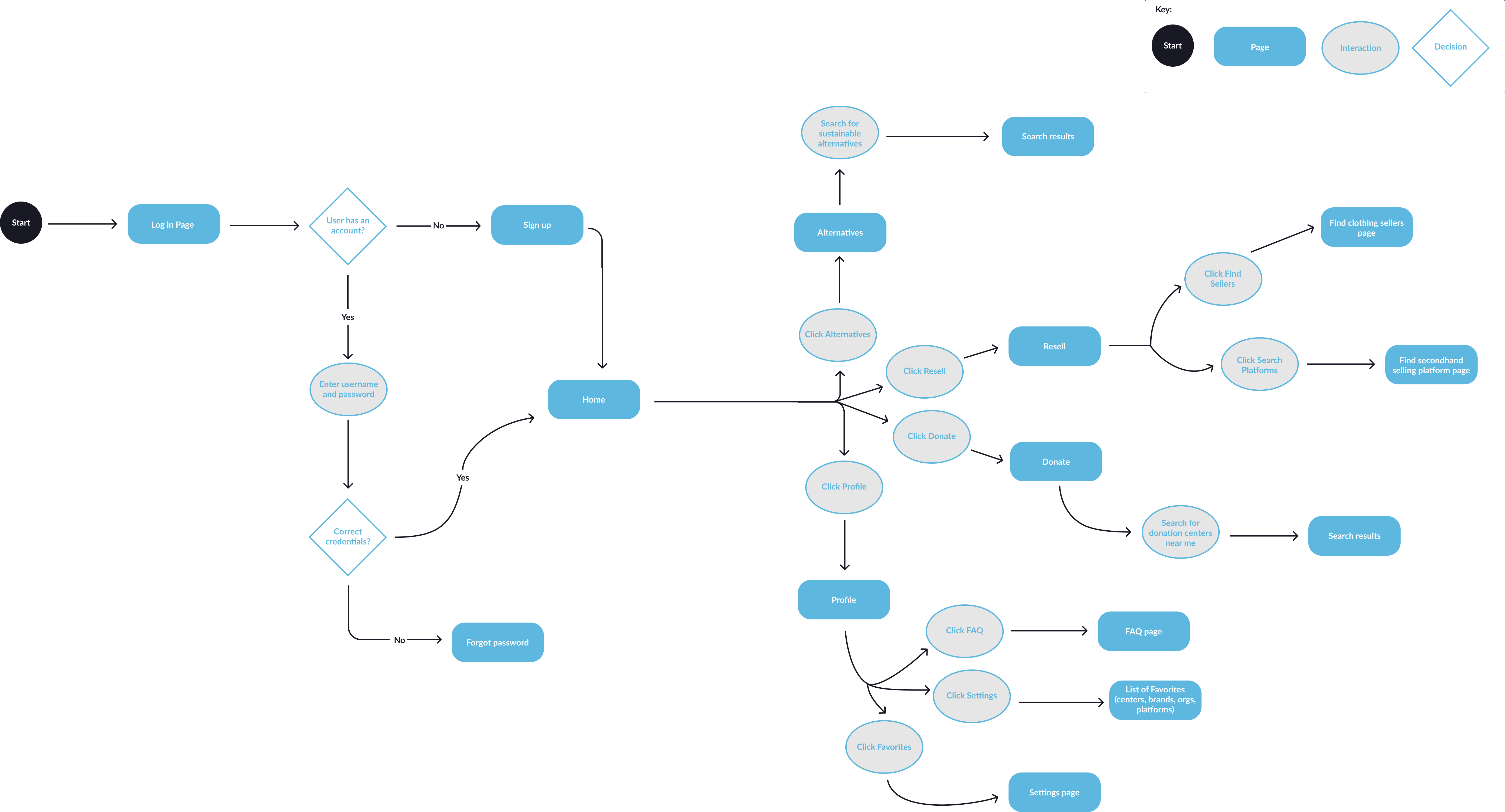
Expanding on our ideation phase, we collaborated on creating a comprehensive user flow diagram to visualize the optimal user experience and identify key features and actions needed to effectively solve the defined problem.
Click to enlarge
Wireframes
Translating sketches into wireframes. 
After identifying key components through refinement of the user flow, we developed a set of mid-fidelity wireframes. This process focused on optimizing usability and content organization, laying the groundwork for the visual design phase.
Wireframes stacked in black and white
Click to enlarge
User Testing
Iterative refinement through prototyping
To validate our design decisions, we created a low-fidelity prototype. Testing this prototype revealed critical usability issues in two key areas: navigation and the alternatives feature. Based on user feedback, we implemented several improvements:
Streamlined navigation
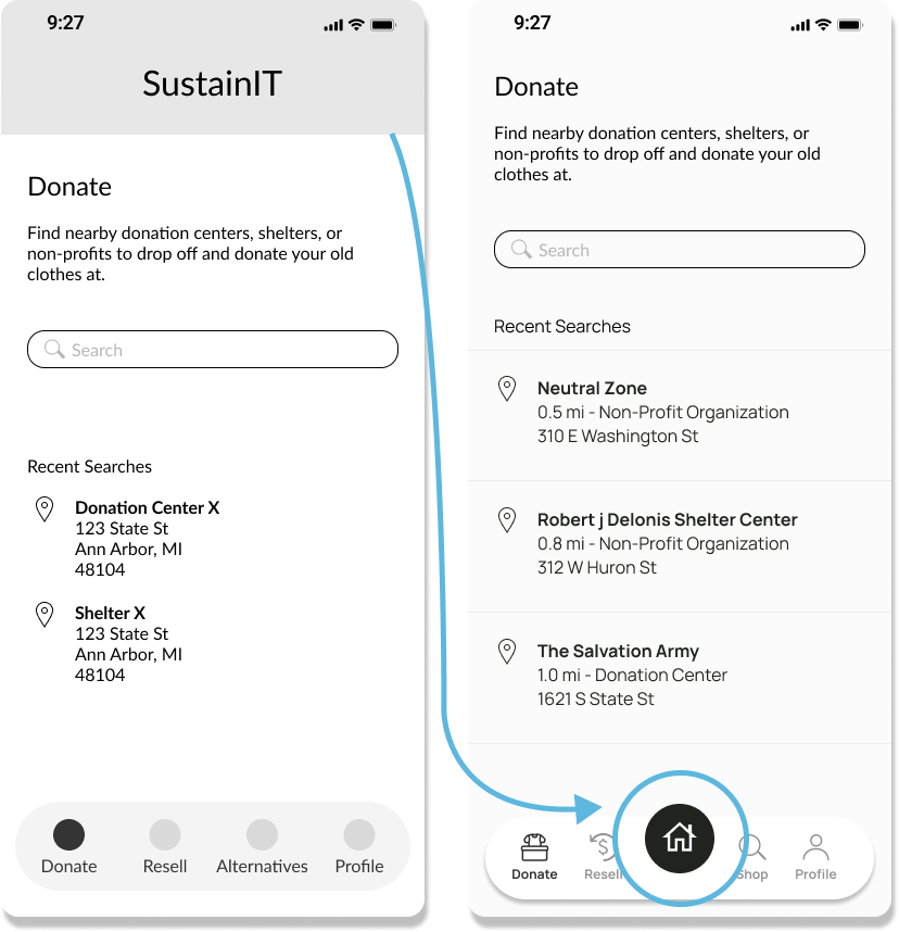
Users struggled to return to the homepage and felt the header took up too much screen real estate. To alleviate the confusion and optimized space usage, we removed the fixed header, integrated a prominent home button into the navigation menu.
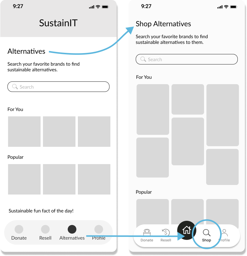
Clarifying "alternatives" functionality
The term "alternatives" throughout the experience, most notably in the navigation menu, caused confusion and misinterpretation.
To clarify the meaning, we relocated this feature from the main navigation to the shop section, which we later renamed likes, making it a more intuitive part of the user's personalized experience.
Final Design
Key Features of SustainIt
Seamless reselling experience
Users can easily connect with nearby sellers or explore online resale platforms, streamlining the secondhand selling process.
Sustainable brand discovery
Users can discover eco-friendly alternatives to their favorite brands.
Convenient donation options
Users can find nearby donation centers, shelters, or non-profits to drop off and donate their used clothes. 
Personalized experience
Users can select their preferences to experience a curated, tailored guidance for sustainable shopping.
View Prototype
Reflection
Final thoughts
SustainIT aims to address the CHI 2023 goal of responsible consumption and production by creating a comprehensive platform that connects buyers and sellers, facilitates donations, and promotes sustainable fashion alternatives. 

Given more time for future development, I would explore implementing a robust vetting system for sellers to ensure user safety and prevent potential misuse of the platform.
Key takeaways

Don’t jump to conclusions

This project taught me the importance of a comprehensive, holistic research process. It demonstrated how crucial it is to validate assumptions and avoid premature conclusions based on limited data.

Prioritizing user needs

The iterative design process in this project reinforced the importance of continuously aligning our design choices with actual user needs and behaviors, despite the allure of innovative feature enhancement.  

Send me a message 
and let's connect!

© 2024 Logan Hanekamp. All Rights Reserved.
crossmenuchevron-downarrow-uparrow-left