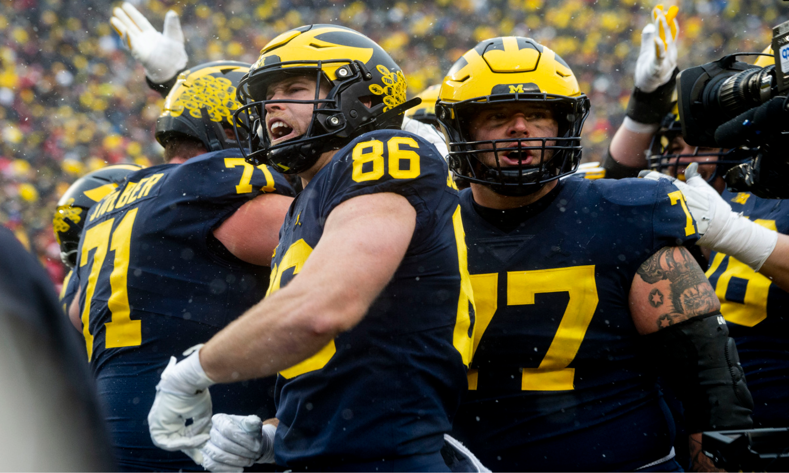
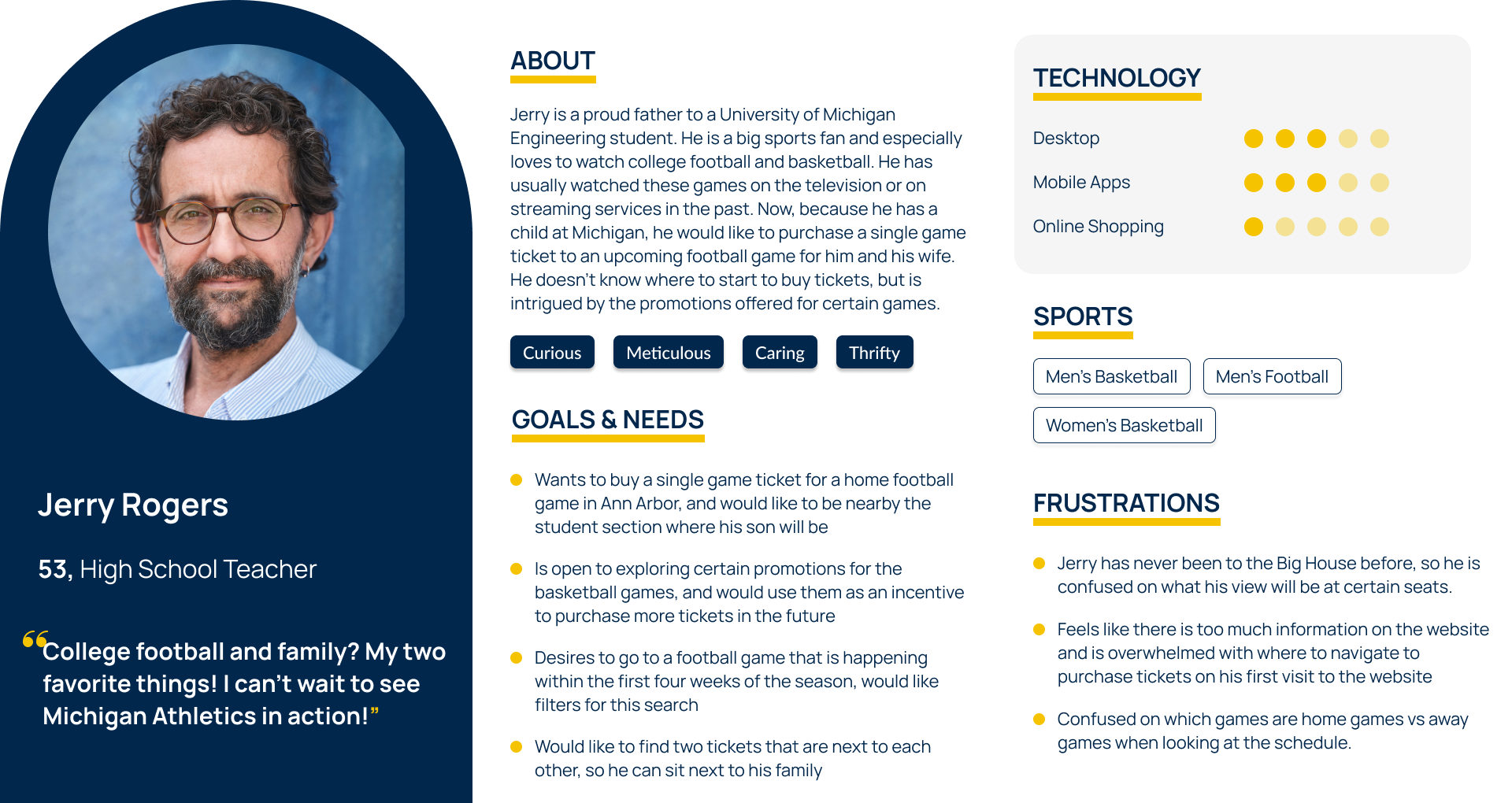
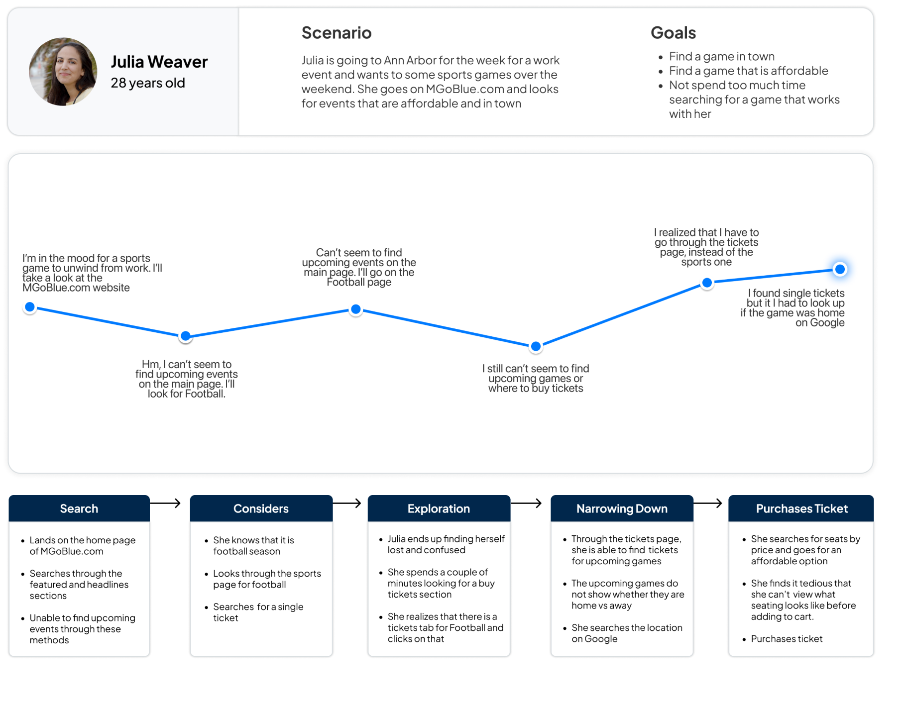
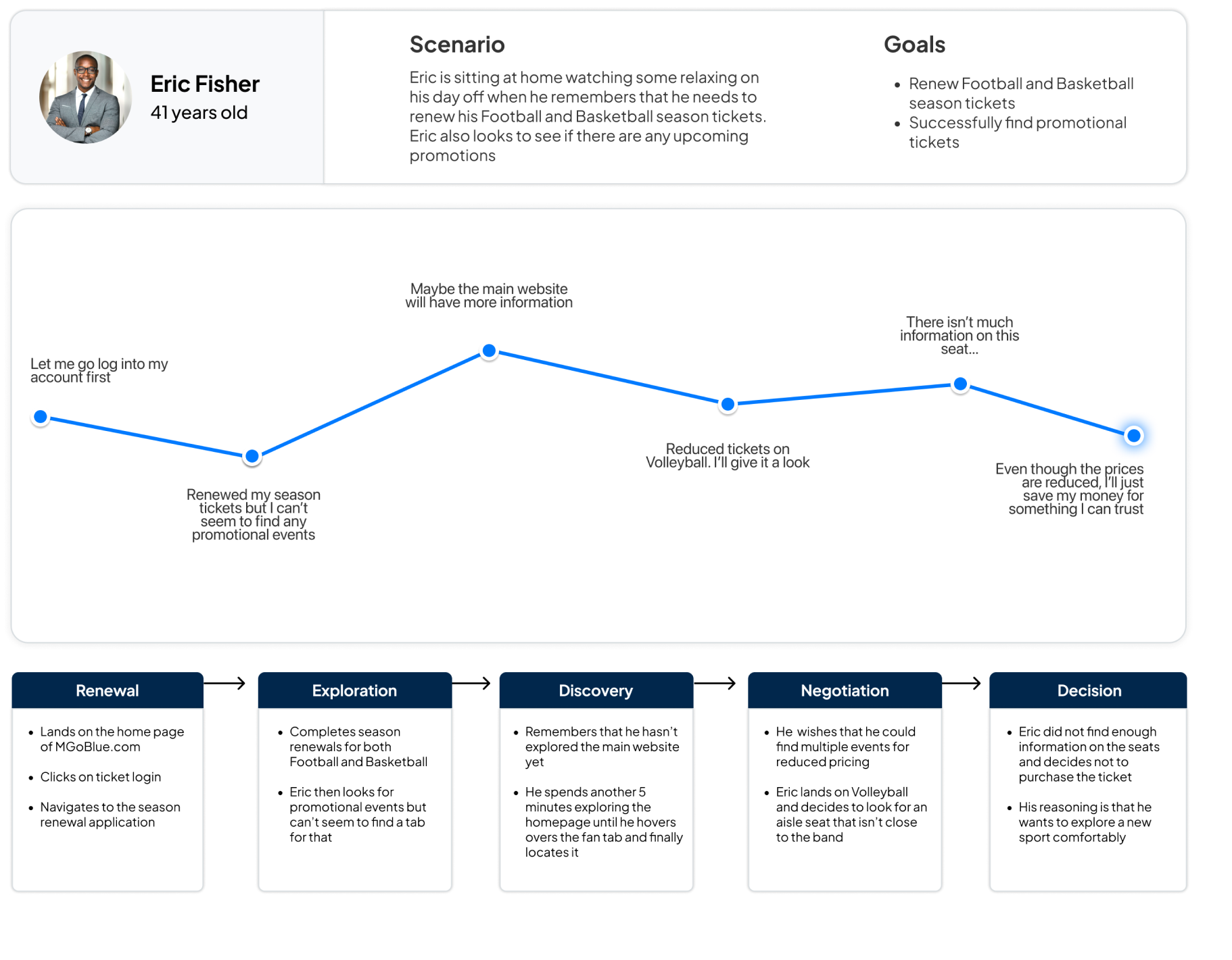
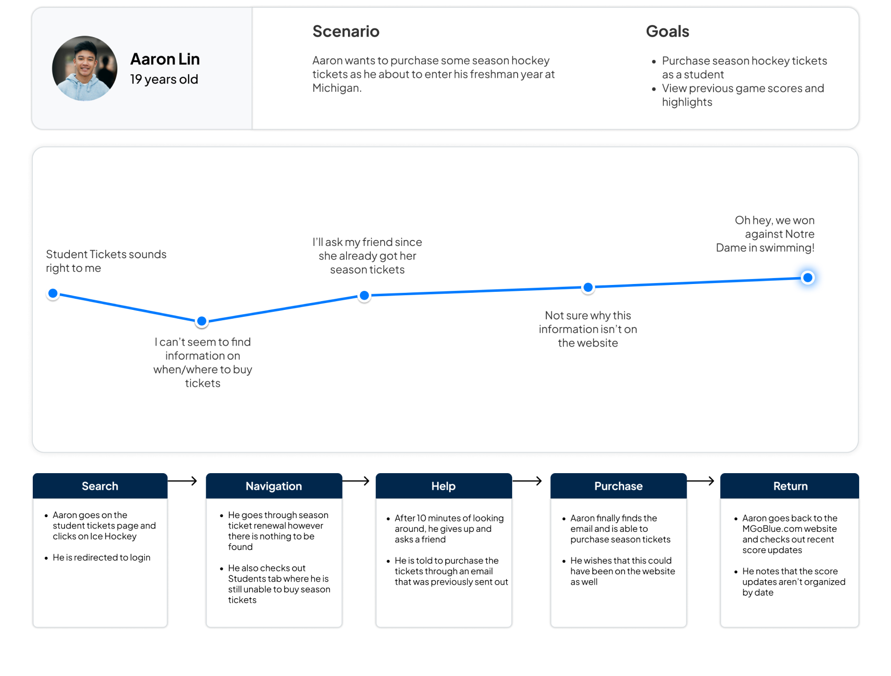
UM Athletics Tickets

Importance of information on MGoBlue.com
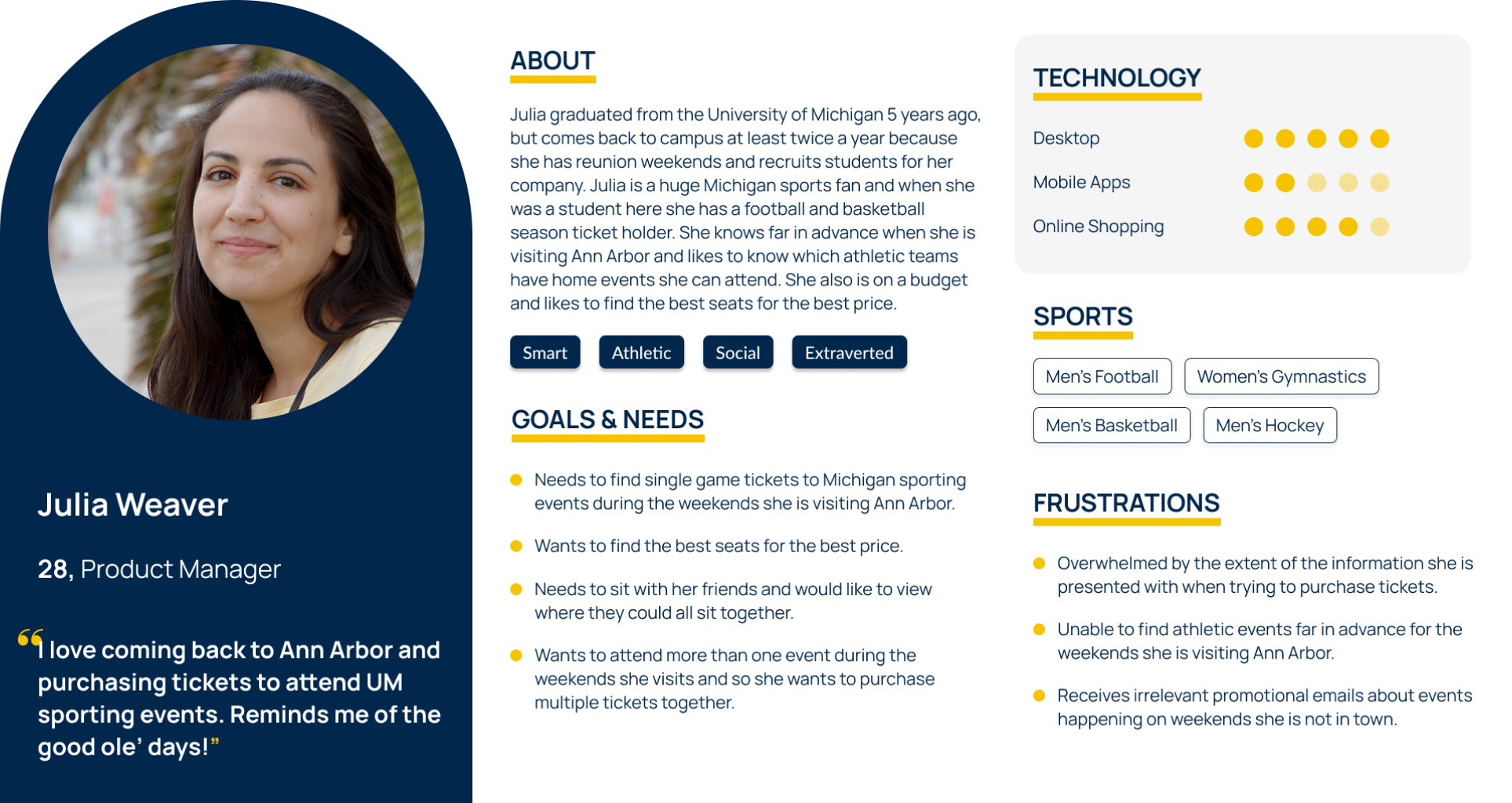
Click to enlarge

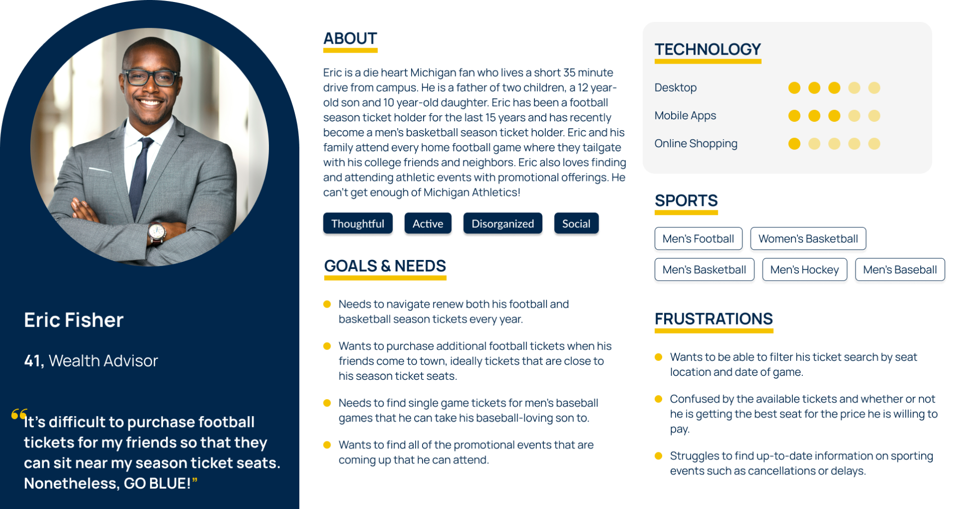
Click to enlarge
Typography
Headings
| Typescale | Size | Weight |
|---|---|---|
| H1 Headline | 35px | Bold |
| H2 Headline | 30px | Bold |
| H3 Headline | 24px | Bold |
| H4 Headline | 18px | Bold |
Body & UI
| Typescale | Size | Weight |
|---|---|---|
| Drop down text | 20px | Normal |
| Paragraph text | 16px | Normal |
| Button text | 16px | Bold |

Color

Spacing
38%
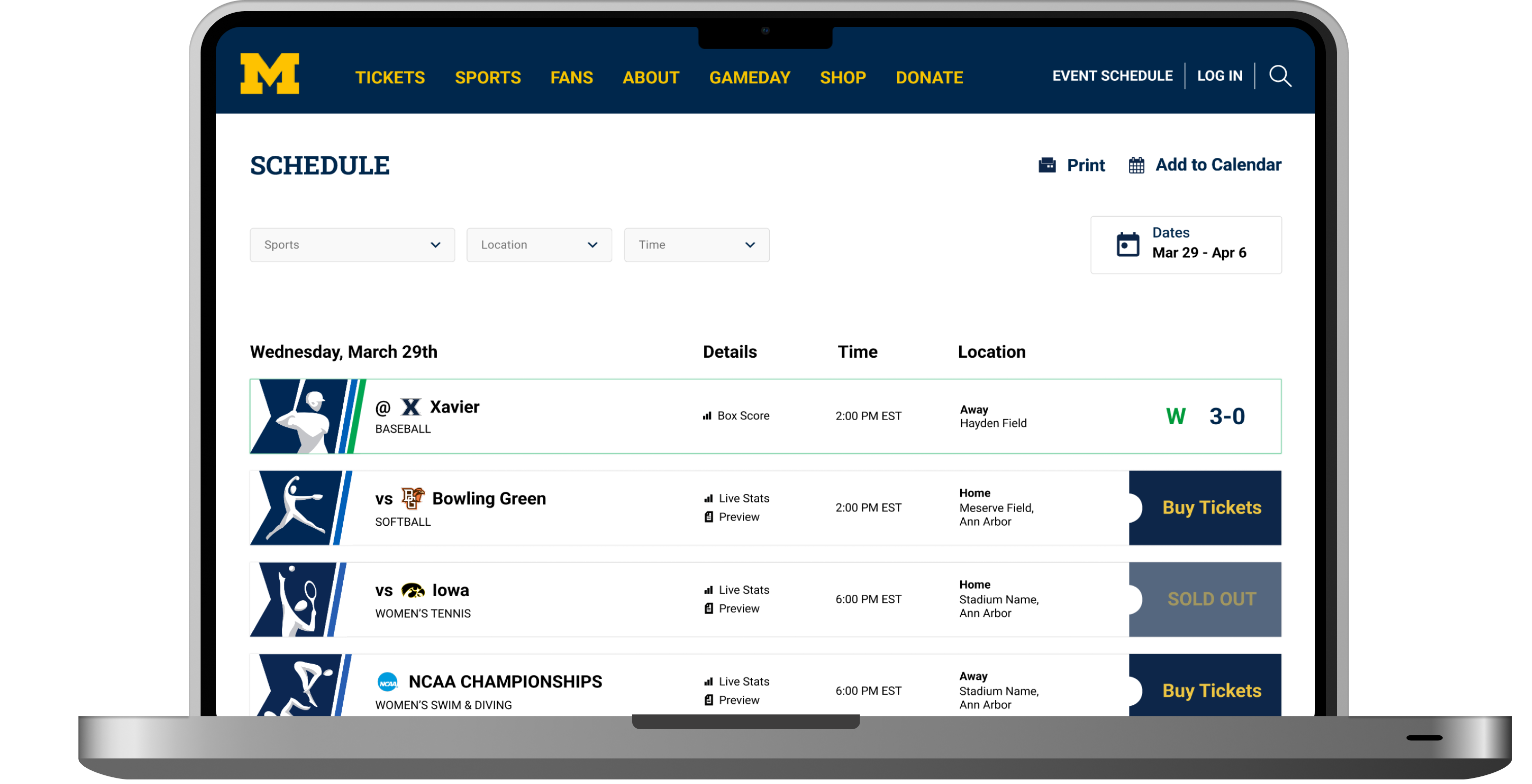
faster to find tickets in Version B with a 100% task completion rate
66%
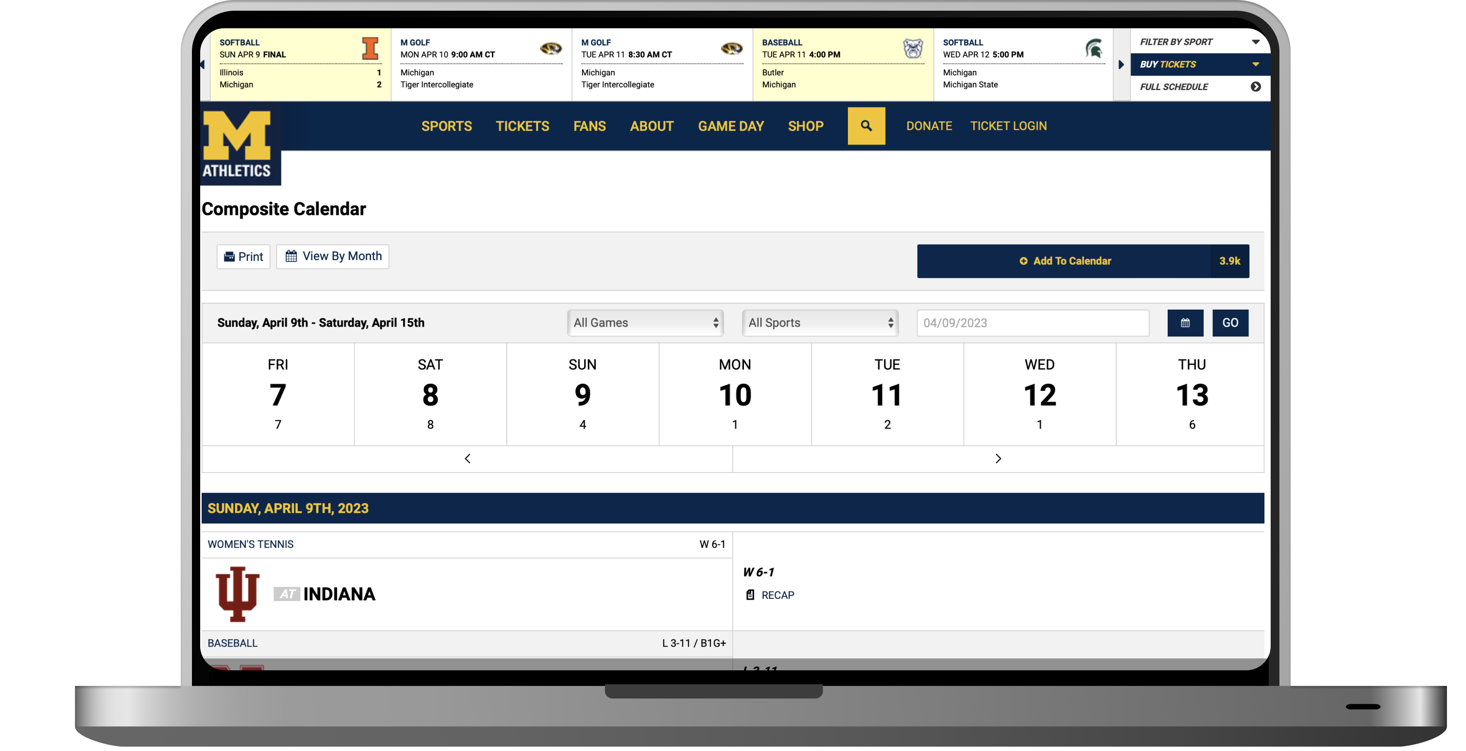
of Version A users disliked the event schedule hierarchy
100%
of users preferred the ticket hover dropdown in Version B
Simplified navigation
Tickets were buried in overwhelming dropdown menus. We prioritized tickets in the main nav, condensed dropdowns into two columns with quick-link buttons, and separated login, schedule, and search into a secondary bar.

Reorganized sport pages
Users found the sport-specific pages overwhelming, with disorganized and repeated information. To streamline the pages and highlight key details, we implemented a card-based layout for ticket options and removed redundant elements.
Enhanced filtering
Limited filters made it hard to find specific events. To ease the process of finding and comparing events, we installed clear filtering options for sports, location, and time.
Next project
Quizlet
Redesign