UX Research
Interaction Design
Usability Testing
Visual Design
Prototyping

UM Athletics Tickets

A redesign of the University of Michigan Athletics ticket purchasing experience, focused on simplifying navigation, reducing information overload, and streamlining the path to purchase.
ROLE Designer & researcher
TEAM Kevin Choi, Adrian Berrigan, Elizabeth Yang
TIMELINE Sept 2022 - Apr 2023
MGoBlue.com is the primary digital channel for Michigan Athletics, spanning 29 varsity sports and over $50M in annual revenue from 13 ticketed sports. However, the ticketing experience was complex and information-heavy, making it difficult for fans to quickly find and purchase tickets.
The goal was to reduce information overload and simplify the path from landing page to ticket purchase, creating a more intuitive and efficient purchasing experience for fans.
Working alongside a team of three in partnership with the Michigan Athletics department, I led research and design to streamline the ticket discovery and purchase flow, improving clarity and reducing friction across key decision points.
[ Problem ]
How might we simplify the ticket purchasing experience on MGoBlue.com to reduce friction and better connect fans with the events they care about?
29
Varsity sports
13
Ticketed sports
$50M
Annual ticket revenue
[ Research ]
Understanding Michigan fans and the competitive ticketing landscape

We analyzed direct, indirect, and analogous competitors to identify design opportunities across six areas: navigation, featured content, user journey, information architecture, filtering, and mobile experience.

Competitive analysis

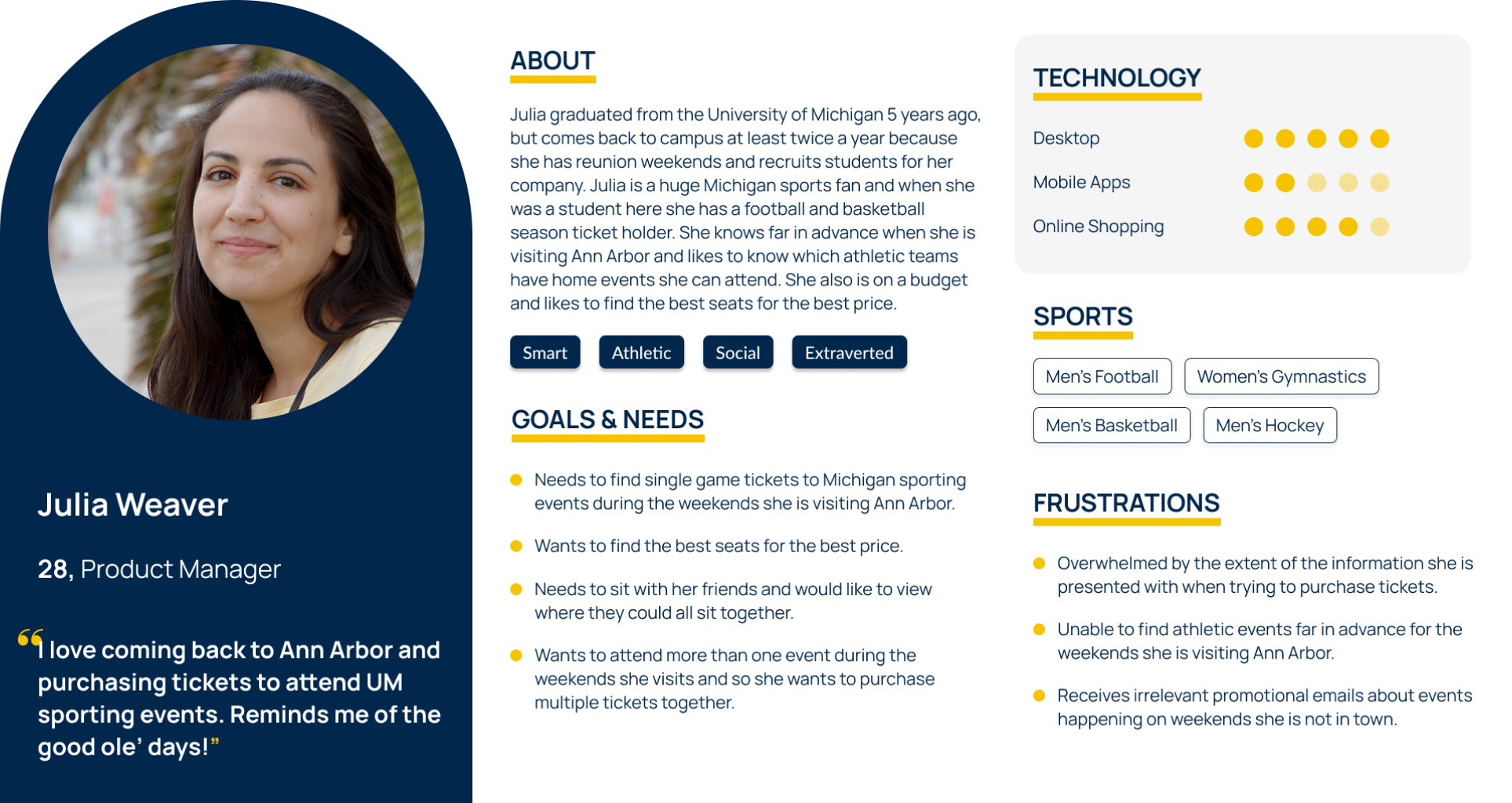
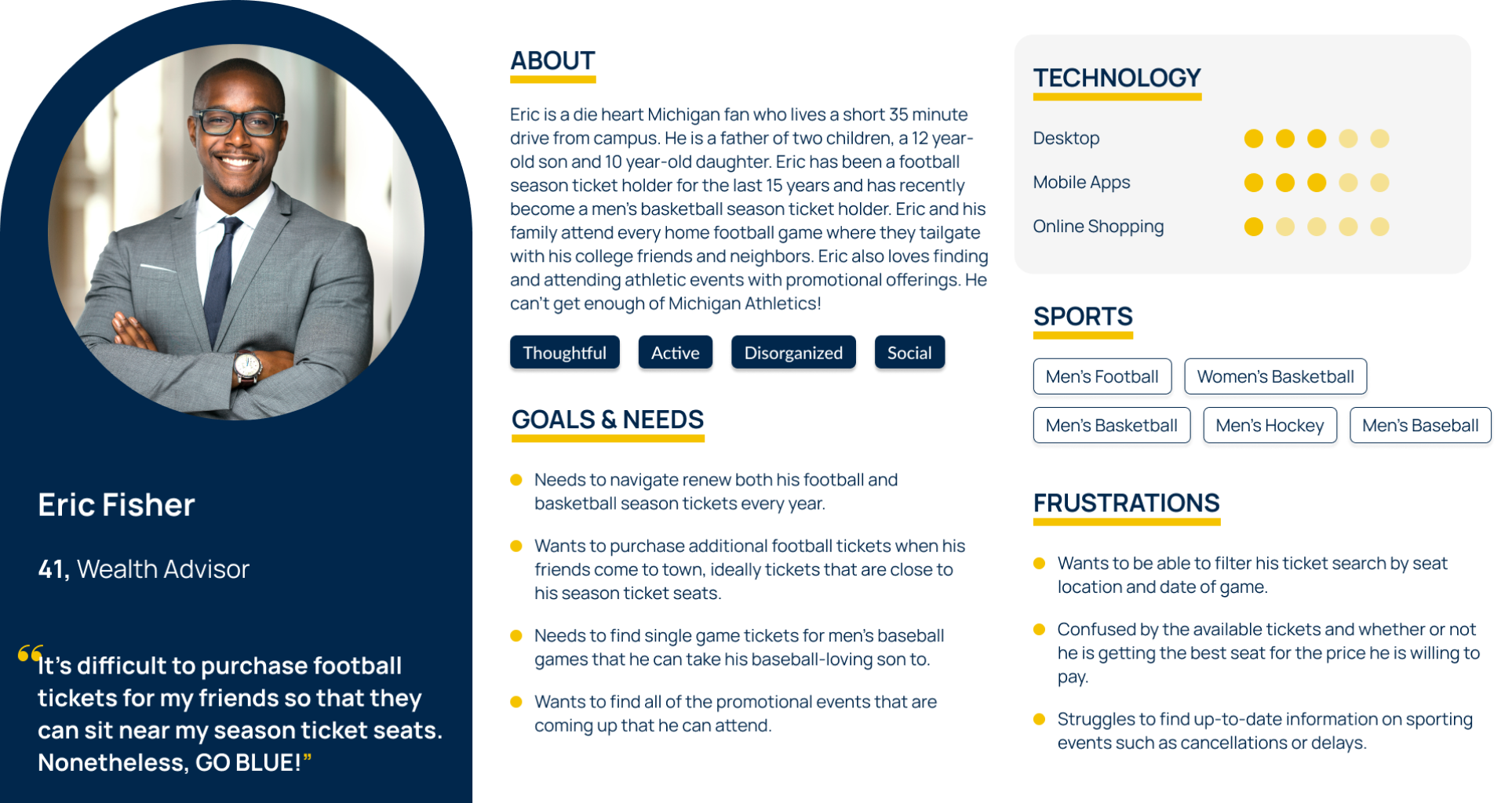
Distributed through the athletic department's email list, the survey gathered insights from 1,200 customers on purchasing behaviors, preferences, and pain points with the current experience.

Importance of information on MGoBlue.com

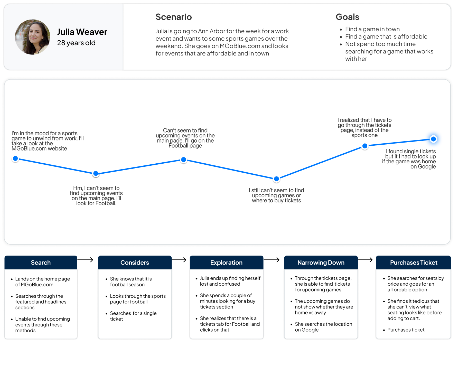
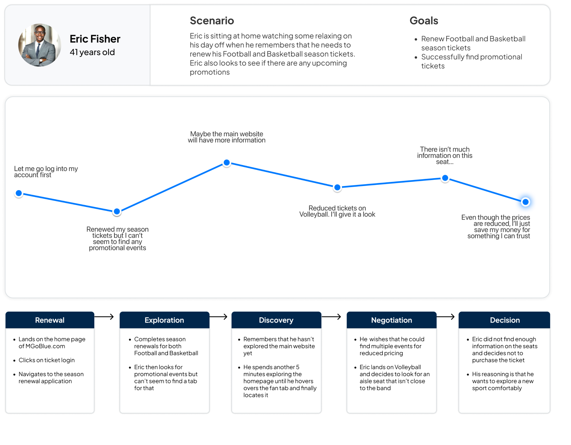
We conducted contextual inquiries with 7 participants selected from survey respondents. The 30-minute sessions surfaced patterns in navigation behavior, feature expectations, and friction points on MGoBlue.com.

"The pages have too much information. It makes me feel distracted and not wanting to engage with it."
"It's hard to find tickets sometimes and the seating tiers are also hard to find so I will just go to Stubhub instead."
"If there weren't so many different links in the navigation, I could probably understand where to find that [specific ticket] better."
Competitive analysis
Research revealed gaps in the experience creating a complicated and inefficient purchasing experience for fans.
/ 01 Complicated navigation Users struggled to find the right page for purchasing tickets due to unclear labels and overwhelming dropdown menus.
/ 02 Information overload Cluttered pages with repeated and unnecessary content slowed down the ticket purchasing process and frustrated users.
/ 03 Poor seat selection and filtering Users wanted more comprehensive filters and clearer seat availability — closer to what StubHub offers.
/ 04 Missing key features Event saving, advanced sorting, and accessible promotions were absent despite being common on competitor sites.
[ ideation ]
Defined personas and mapped the user journey from research insights
Four key themes from research informed four distinct personas, each representing different motivations, frustrations, and levels of technical comfort among Michigan Athletics ticket buyers.
Julia Weaver
Eric Fisher
Aaron Lin
Jerry Rogers
1 / 4
Mapped the emotional experience across four user scenarios
Building on our personas, we created journey maps for each user type to trace the highs and lows of their current experience on MGoBlue.com. This helped us identify the specific moments where friction was highest and prioritize which problems to solve first.
Julia Weaver journey map
Eric Fisher journey map
Aaron Lin journey map
Jerry Rogers journey map
1 / 4
[ interaction Design ]
Designing for the core user problem
Focusing on landing on the homepage to navigating ticket pages and the event schedule, we explored multiple directions for each before landing on the strongest concept for our personas.
[ Visual Design ]
Creating the design system
Before creating high-fidelity prototypes, we developed a design library consisting of components, typography, layout spacing, icons, and color schemes. This allowed us to maintain consistency with the current website and brand identity and across the user flows.

Typography

Headings

TypescaleSizeWeight
H1 Headline35pxBold
H2 Headline30pxBold
H3 Headline24pxBold
H4 Headline18pxBold

Body & UI

TypescaleSizeWeight
Drop down text20pxNormal
Paragraph text16pxNormal
Button text16pxBold
Michigan Athletics

Color

Copied
Main
#1B3A6B
Click to copy
Copied
Secondary
#FFCB05
Click to copy
Copied
Hover
#00B2E3
Click to copy
Copied
Paragraph
#181924
Click to copy
Copied
Grey
#828282
Click to copy
Button components

Spacing

Left & right margins 48px
Header 48px
Section label to title 16px
Section to section 40px
Icon to label 20px
H3 to card 24px
Cards 32px

Iconography

Filter
Calendar
Schedule
Event
Video
Stats
Document
Audio
[ Usability Testing ]
A/B tested with 7 participants, focusing on information hierarchy, filters, and iconography.

38%

faster to find tickets in Version B with a 100% task completion rate

66%

of Version A users disliked the event schedule hierarchy

100%

of users preferred the ticket hover dropdown in Version B

[ Final design ]
Here's what changed
/ 01

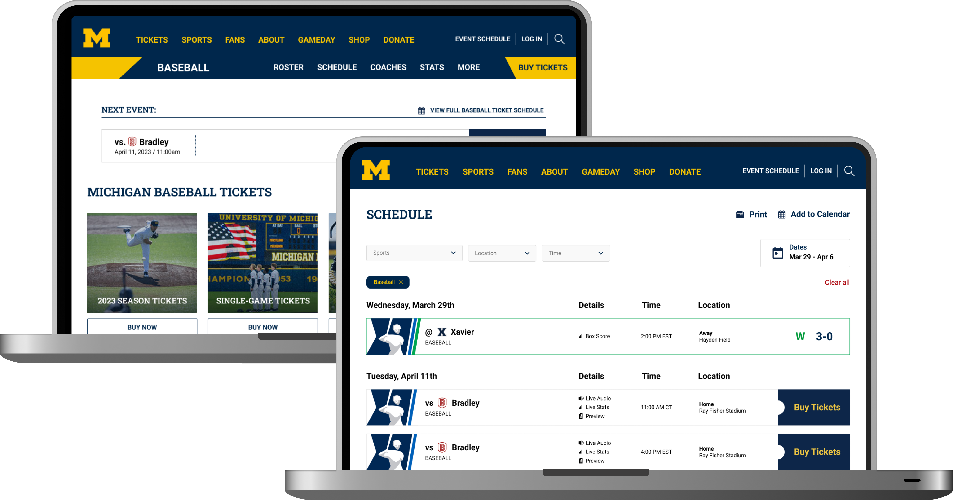
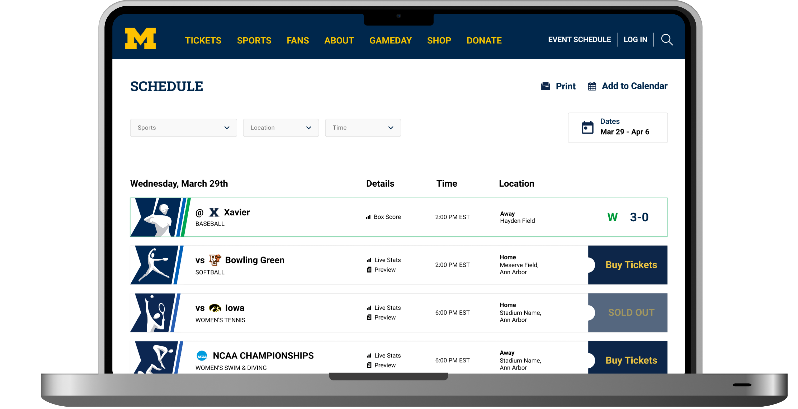
Simplified navigation

Tickets were buried in overwhelming dropdown menus. We prioritized tickets in the main nav, condensed dropdowns into two columns with quick-link buttons, and separated login, schedule, and search into a secondary bar.

Before Navigation before
After Navigation after
/ 02

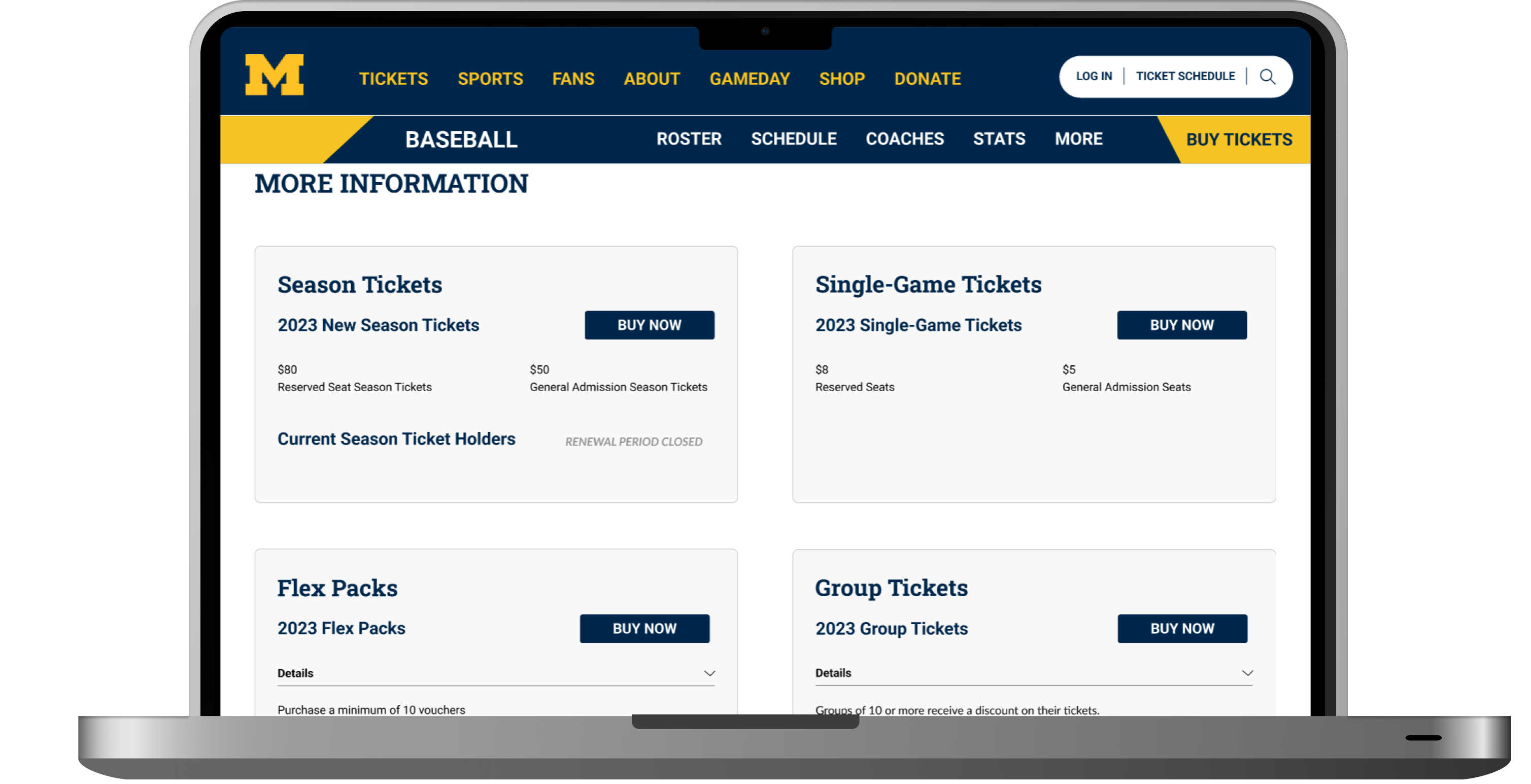
Reorganized sport pages

Users found the sport-specific pages overwhelming, with disorganized and repeated information. To streamline the pages and highlight key details, we implemented a card-based layout for ticket options and removed redundant elements.
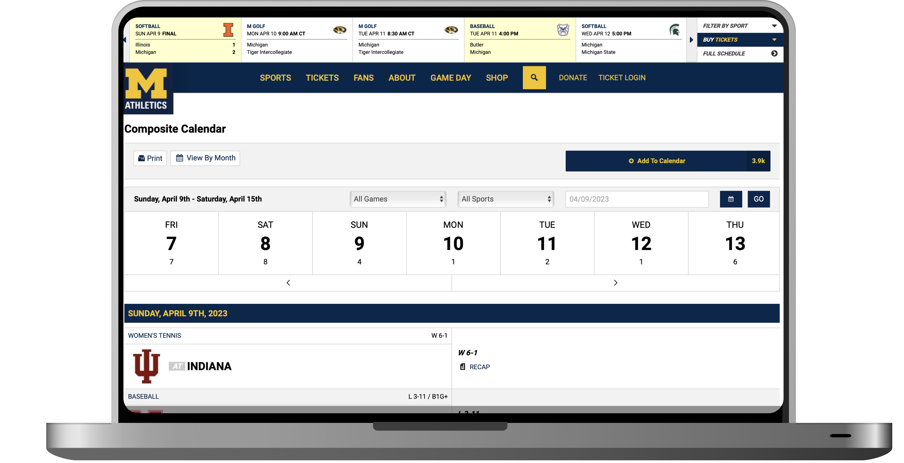
Before Sport page before
After Sport page after
/ 03

Enhanced filtering

Limited filters made it hard to find specific events. To ease the process of finding and comparing events, we installed clear filtering options for sports, location, and time.

Before Filtering before
After Filtering after
Final experience
Takeaways
Stakeholders know their users Partnering directly with Michigan Athletics shaped every research decision. Their knowledge of the fan base helped us ask better questions and build something tailored to their audience.
Information hierarchy and organization is key The biggest usability gains came from small structural changes like repositioning the ticket schedule link and simplifying dropdown labels. The content was never the problem. The organization was.
A/B testing what you can't predict We had assumptions about which version would win. Testing changed those assumptions on nearly every metric. Running it earlier would have saved iteration cycles.
We delivered a foundation, not a spec The prototype is a validated direction, not a defined blueprint. The core architecture and layout principles were tested and those should be preserved even as implementation details evolve.
View all

Selected Work

All projects

© 2026 Logan Hanekamp.
crossmenuchevron-down