Logo: LH

Quizlet Redesign

WHEN
Oct - Nov 2022
TEAM
Julia Reel
ROLE
UX Researcher, UI & UX Design
TOOLS
Figma, Miro
Quizlet.com redesign
Copyright: All images in my unsolicited design are copyrights of Quizlet.
An unsolicited redesign of the Quizlet website to consolidate information architecture and optimize the user journey to improve the online study experience.
Skip to Solution
See More Line
Background
Redesigning the digital learning experience.
Quizlet, established in 2005, has evolved from a simple study tool into a comprehensive digital learning platform. It provides its users with various study tools including flashcards, games, and practice exams to support learners worldwide. 

This redesign project was inspired by insights gained during a user research methods course at the University of Michigan School of Information. The research uncovered several usability issues that significantly impacted the user experience on the Quizlet website, prompting me to undertake this redesign initiative.
Why Redesign
After in class research, I realized there were several usability issues that negatively impact the Quizlet user experience. 
I started this redesign after finishing a user research methods course at the University of Michigan School of Information where I collaborated with another student to evaluate Quizlet.com.

After we conducted a survey of 25+ individuals and a usability test, I realized there were several usability issues with the Quizlet website that negatively impact the user experience. I took the insights we gained and completed an independent, unsolicited redesign of the Quizlet website.
Research
Surveying online study habits and preferences.
We distributed a survey through a student-run online group messaging platform, reaching over 25 Quizlet users. The survey aimed to understand how students approach studying for their classes, the utilization of online study tools, and general sentiments towards Quizlet and its features.
Research findings:
Click to enlarge
pie chart
Click to enlarge
usability Testing
Uncovering user pain points. 
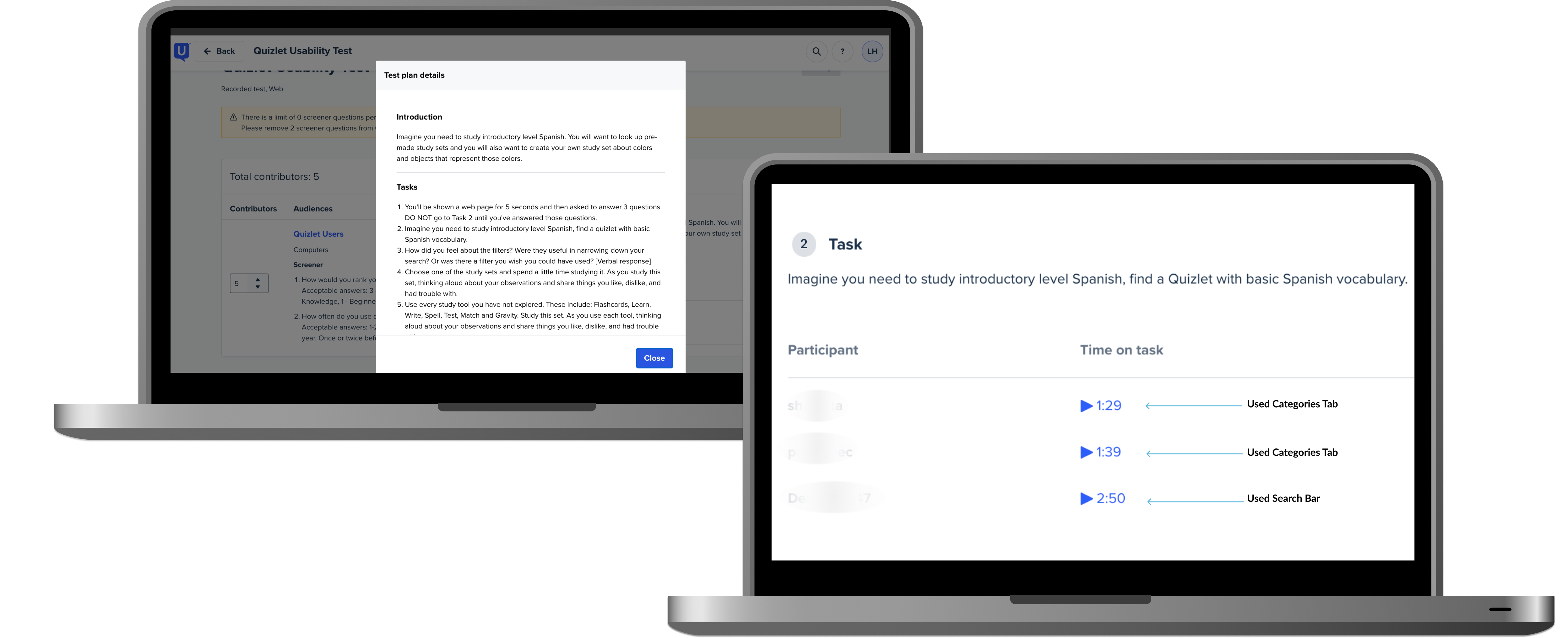
Building on our survey insights, we conducted a usability test. We used our valuable insights from the survey to design a usability test to pinpoint the main frustrations users were experiencing while navigating the Quizlet website. 
Key user pain points:

01

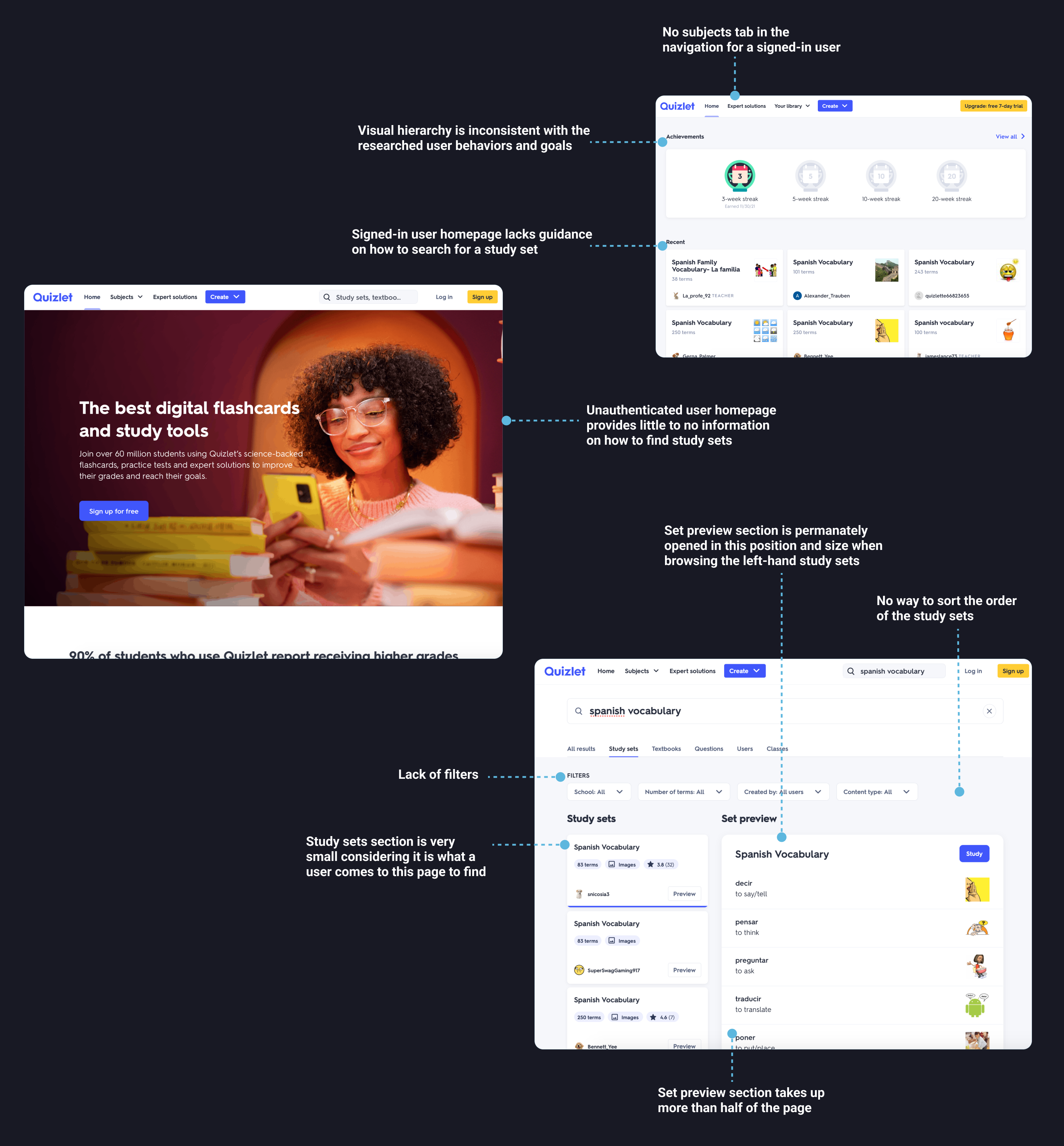
Confusing homepage
Users found the homepage difficult to navigate due to minimal information and poor organization. One participant said: "It doesn't look like there is anywhere down here [on the homepage] for me to find any study set."

02

Difficulty locating specific study sets
The participants who used the search bar method to find a specific study set struggled to find the desired set due to cluttered results and overwhelming filter options.

03

Cluttered search results
Many of the participants struggled to understand the results of searching due to the poorly organized search results page, making it difficult to know what a study set is and how to navigate to it.

04

Ineffective search filters
50% of participants had difficulty finding and using search filters. Some participants didn't notice the filters at all, with one participant noting they "wished there was one."
Defining the Problem
Our research and further exploration revealed the primary issues user face revolve around the homepage design, inconsistent navigation, cluttered search results, and ineffective filters functionality.
Click to enlarge
End of Class Project
The rest of this work represents an independent redesign I completed after I finished this in-class research project. I was motivated by the significant user pain points uncovered to further develop my user experience design skills by reimagining the Quizlet website.
User Flows
Mapping the user journey.
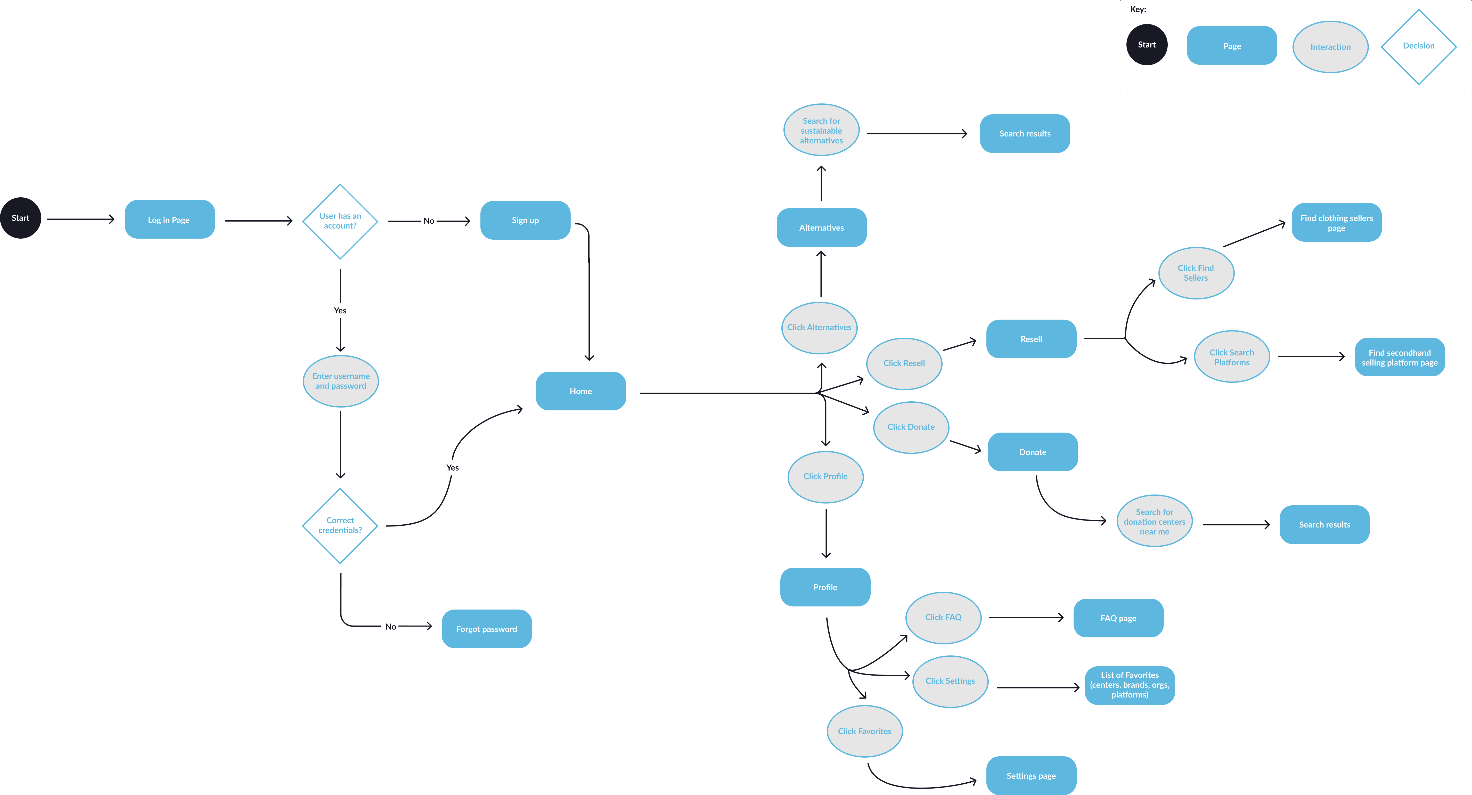
To address the major pain points and usability issues, I created a user flow diagram to map out the user experience for finding a specific study set.

This visual aid was crucial in planning the redesign, helping me identify what the interface shortcomings and opportunities for a more efficient user journey.
Click to enlarge
Scope
Narrowing the project scope following research and ideation phase. 
The scope of my redesign project narrowed to streamlining the user journey from the Quizlet homepage through the search process, aiming to optimize the experience of finding a desired study set for both authenticated and non-authenticated users. 

Given that over 90% of survey participants reported using laptops or desktops for studying, I decided to prioritize the desktop view in my redesign.

Additionally, I will include a subjects tab for authenticated users, addressing a key feature gap.
Sketches
As I refined the scope, I began exploring different ideas.
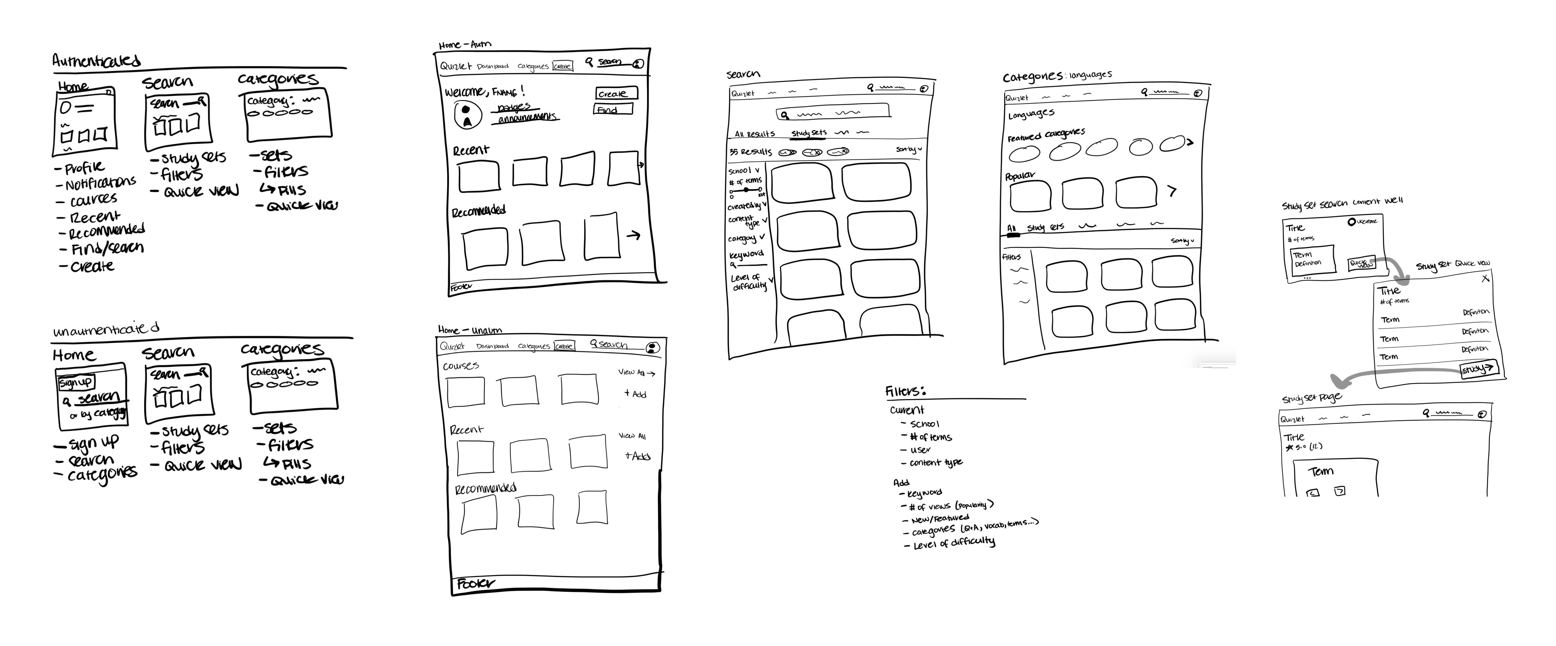
With a better idea of what aspects of the web pages I needed to redesign to help the user experience, I began rapid-sketching different ideas and user flows to determine how the key user interactions would function.
sketches for Quizlet design
Click to enlarge
Wireframes
Translating sketches into mid-fidelity wireframes. 
After identifying the missing components and interaction flow, I created a set of mid-fidelity wireframes, focusing on usability and content organization before incorporating visual design elements.
Wireframes Quizlet
Click to enlarge
Final Design
From user pain points to a final high-fidelity solution.
The final design addresses user frustrations by transforming the enhancing the search process and  simplifying the information architecture. Key improvements include:
Clear and prominent search capability
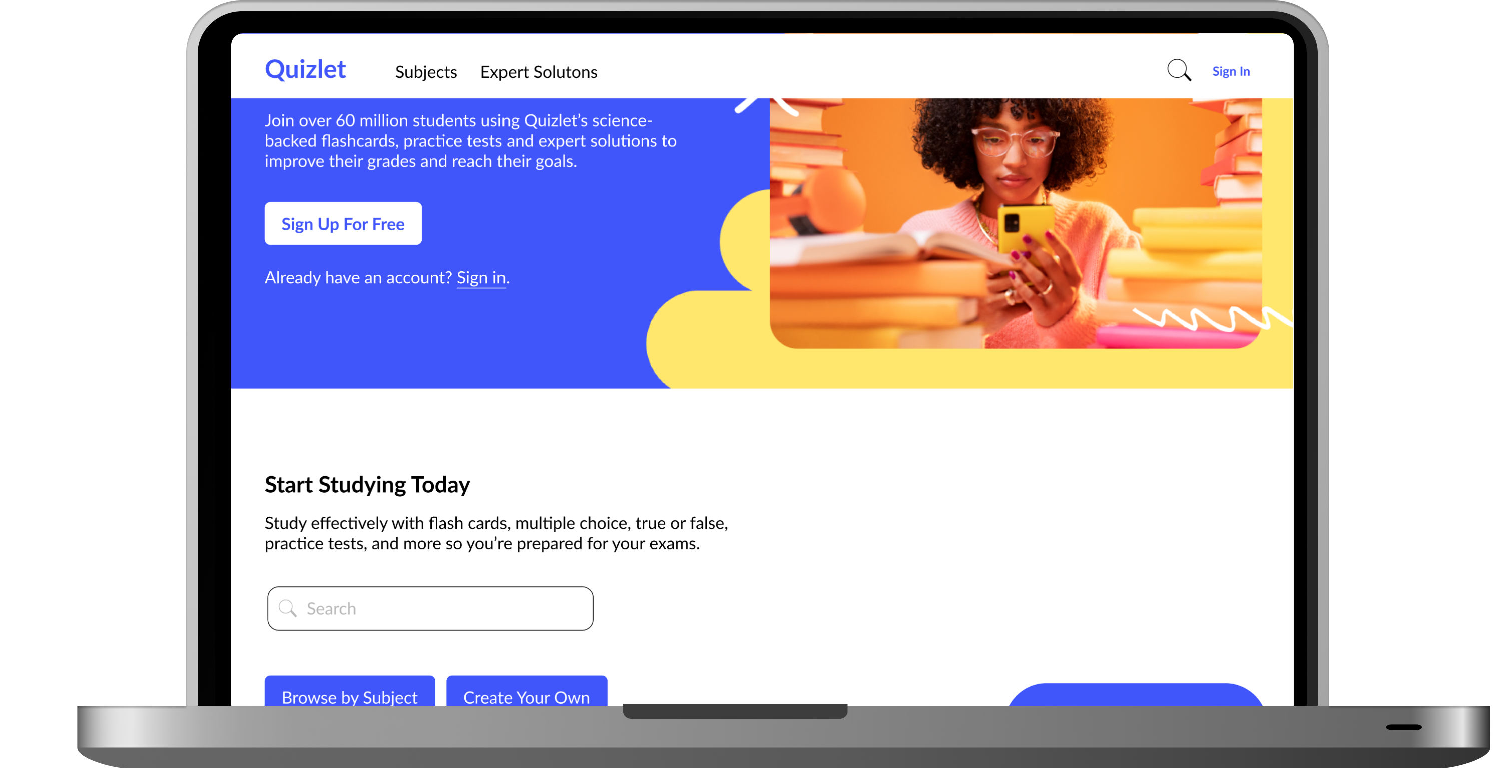
Adding a large search bar directly on the homepage, unauthenticated users will have an easier and more efficient experience searching for study sets. 

Including a "Browse by Subject" button below the search bar also provides users with a clear way to search for study sets compared to the current homepage.
Before
After
Simplified search results page
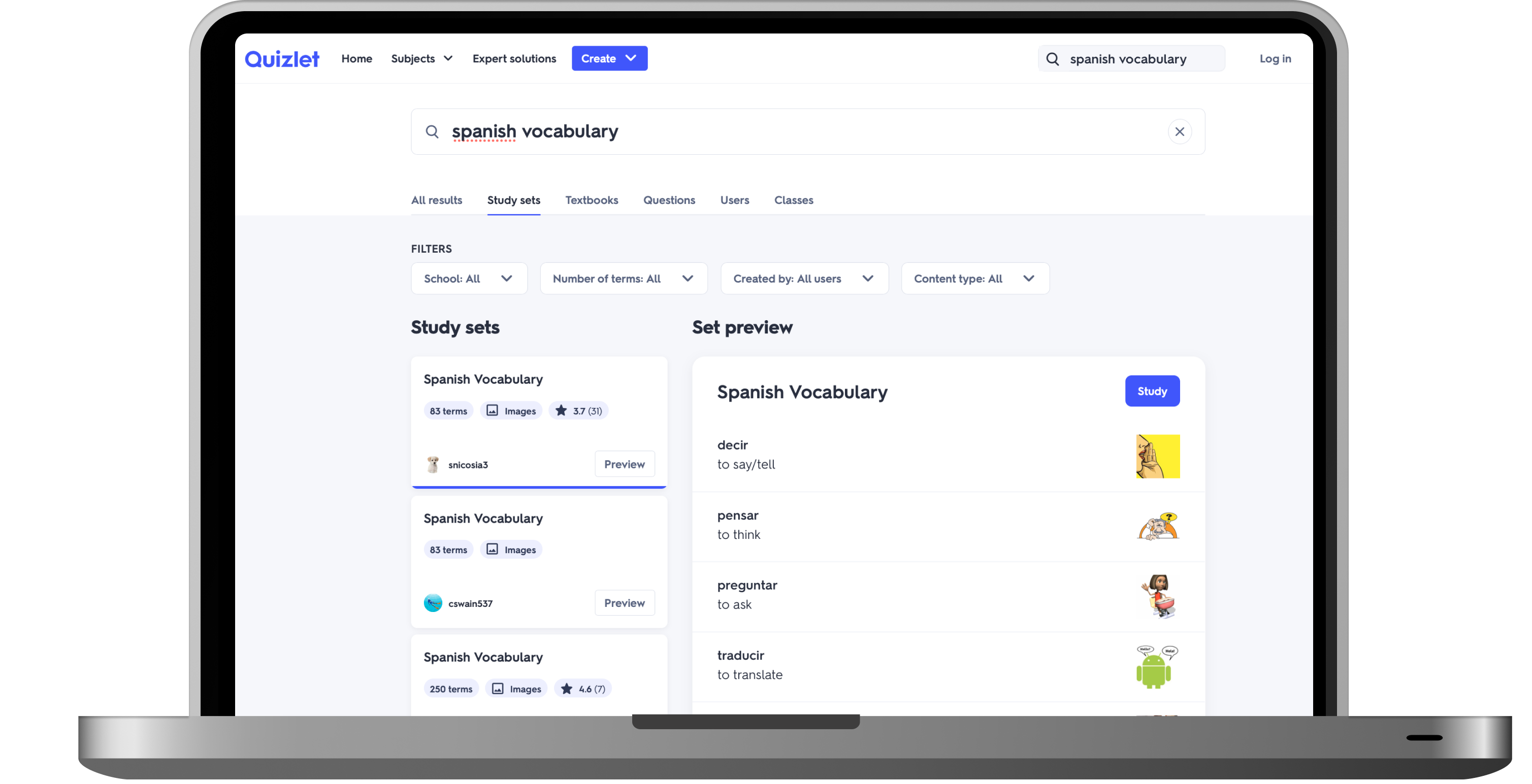
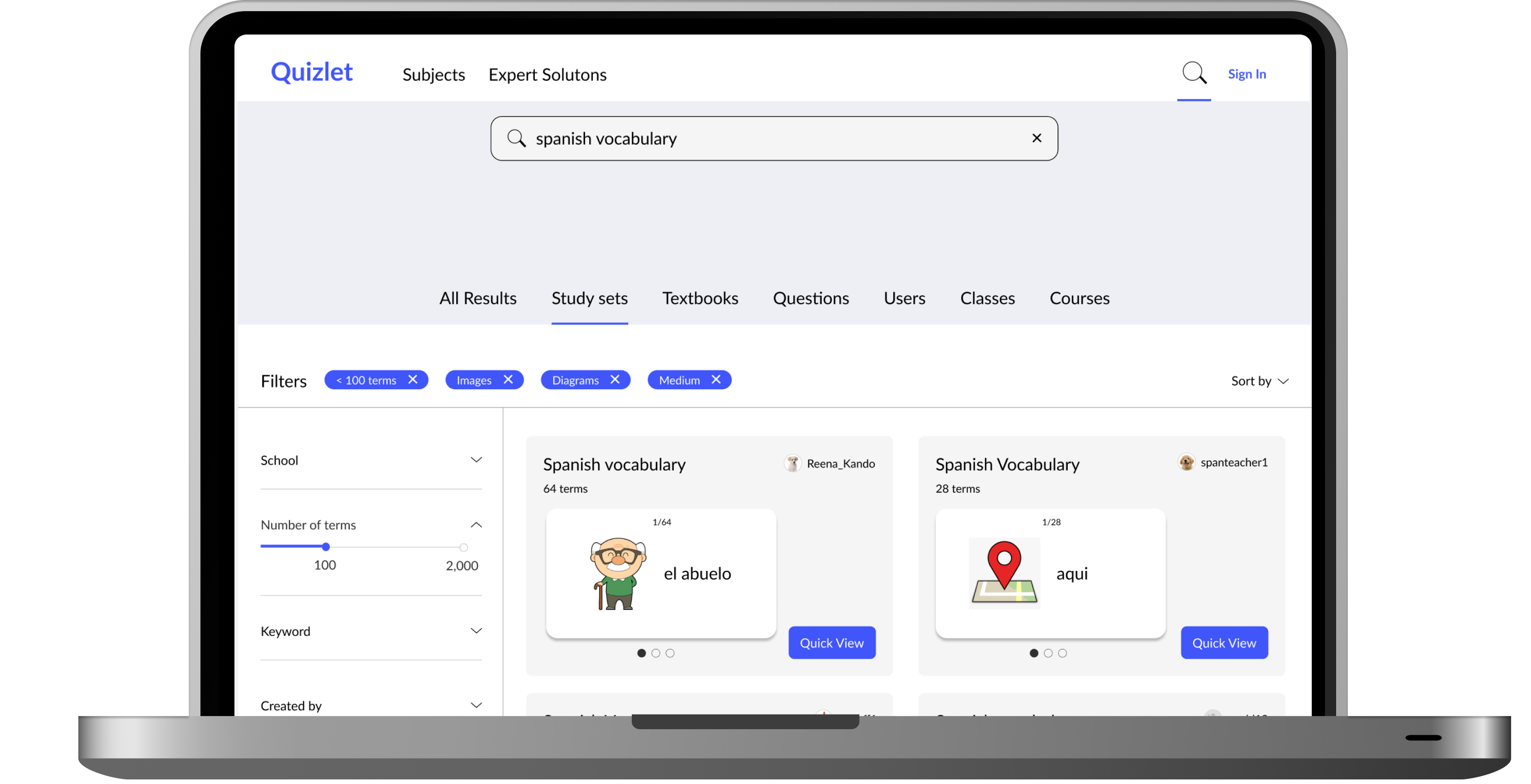
By removing the large Set preview section and replacing this action with a Quick View button on each study set, the search results are easier for the user to digest. 

Improving the filter options and placement allows users to easily see all the filter information and study set options as it is more intuitive and digestible for users.
Before
After
Enhanced authenticated experience
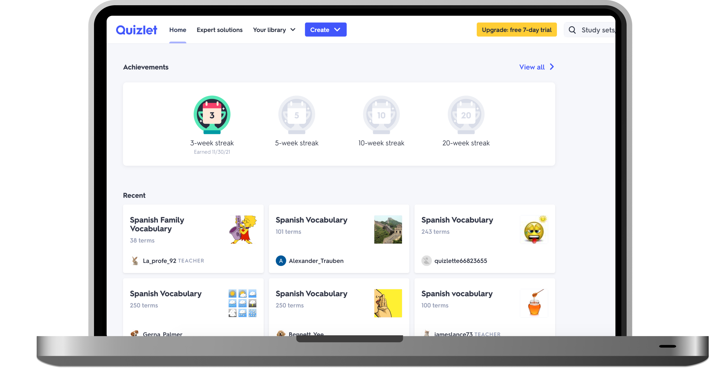
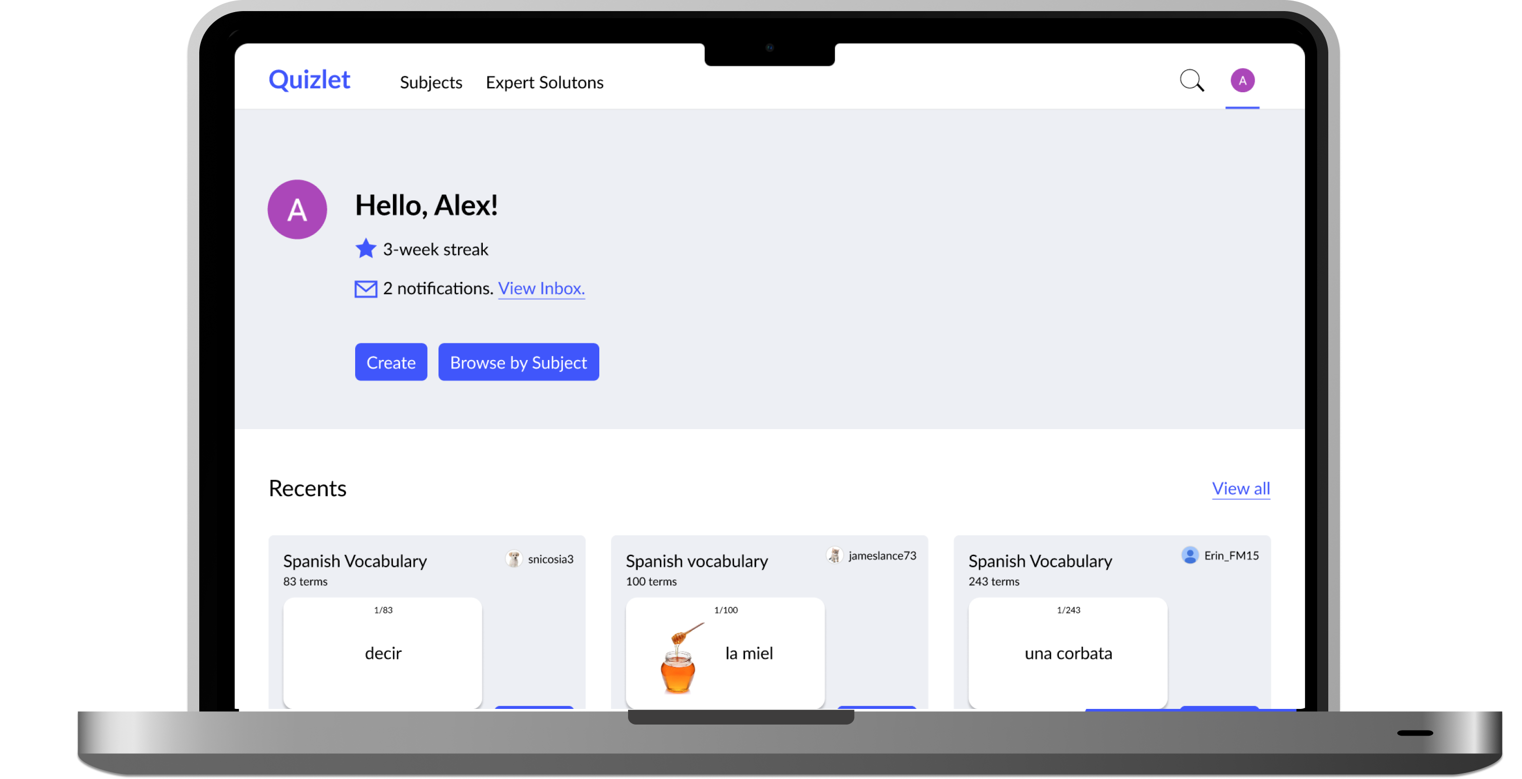
In the new authenticated user homepage, I added a subjects tab in the navigation and a Browse by a Subject button near the top of the page. 

An authenticated user's current homepage lacks the feature to search by subject, thus the inclusion of this feature provides users with the previously missing ability to search for a study set by subject.
Before
After
Final Design Walkthrough
Unauthenticated User Journey
Utilization of the search bar and filters to find a Spanish vocabulary study set.
Authenticated User Journey
Utilization of the subjects tab to locate a Spanish vocabulary study set.
View Prototype
Reflection
Final thoughts
This redesign project, born from the insights gained during our user research, not only resulted in a more user-friendly design for Quizlet, but also enhanced my skills in applying UX principles to solve real-world problems.

By examining Quizlet's existing user interface, I was able to identify key areas for improvement while maintaining consistency with the platform's overall design and language. The resulting design aims to significantly enhance the Quizlet experience for both authenticated and non-authenticated users.
Key takeaways

Power of user research

User research was instrumental in identifying and addressing major usability problems. However, with more time I would analyze Quizlet's user analytics for more targeted improvements.

Design system

Referencing Quizlet's existing UI was crucial for maintaining consistency while improving functionality. Given more time, I would conduct further research to refine filter concepts and wording to match the existing Quizlet language. 
Note: I am not affiliated with Quizlet. This research and unsolicited redesign was done as a class project and further learning experience for myself to explore redesigning a product I frequently interact with.

Send me a message 
and let's connect!

© 2024 Logan Hanekamp. All Rights Reserved.
crossmenuchevron-downarrow-uparrow-leftarrow-right